
Colored pencil landscapes let you build rich scenery with control, color, and surprising depth.
Colored pencil landscapes are one of the most rewarding ways to paint with pencils, because they mix precision with atmosphere. If you want to draw mountains, trees, skies, water, or glowing light in a way that feels calm and alive, this guide will walk you through the full process with practical tips, honest advice, and the kind of detail that helps you improve fast.

What Colored Pencil Landscapes Really Are
Colored pencil landscapes are drawings of nature scenes made with pigment-based pencils instead of paint. They can look soft and airy, or sharp and detailed, depending on how you layer color and pressure. In my experience, they work best when you think less like you are “filling in” an outline and more like you are building the scene in thin, patient layers.
The appeal is easy to understand. Colored pencil landscapes are portable, clean, and flexible. You can sketch outdoors, refine details at home, and keep control over tiny texture changes that would be harder to manage with wet media.
They are also a great match for beginners and advanced artists alike. A simple hill, road, or tree line can look beautiful with only a few pencils, while a complex valley or seascape can stretch your skills in shading, color mixing, and composition.
Why Colored Pencil Landscapes Are So Popular
Colored pencil landscapes have stayed popular because they offer both comfort and challenge. They feel approachable, but they also reward practice in a real way. Each layer teaches you something about light, shape, and edge control.
Here are a few reasons artists keep coming back to them:
• They are easy to start with and do not need much equipment
• They work well for detailed subjects like grass, bark, rocks, and clouds
• They allow slow color buildup, which makes mistakes easier to fix
• They travel well, so plein air sketching is simple
• They suit a wide range of styles, from realistic to expressive
I have found that many artists enjoy colored pencil landscapes because they feel less intimidating than paint. There is no rush to mix a perfect batch of color before it dries. You can stop, think, and return later with fresh eyes.
Essential Supplies for Colored Pencil Landscapes
Good supplies do not need to be expensive, but they do matter. The right tools make colored pencil landscapes smoother, brighter, and more durable. A small set of reliable materials often performs better than a large set of weak ones.
Pencils
Choose pencils with strong pigment and good layering ability. Artist-grade pencils usually blend better and hold up under repeated work. Student-grade pencils can still work, but they often need more pressure to show color, which can damage paper faster.
Useful colors for landscapes include:
• Earth browns for soil, bark, and rocks
• Blue grays for distant hills and shadows
• Yellow greens and olive greens for foliage
• Warm yellows and oranges for sunlight
• Soft grays for mist, clouds, and haze
Paper
Paper choice changes everything. Smooth paper works well for fine detail, but lightly textured paper often gives better layering for colored pencil landscapes. A toothy surface holds more pigment and helps you build rich color without waxy buildup.
Look for paper that is:
• Acid-free
• Strong enough for layering
• Medium to smooth texture for most landscape work
• Able to handle blending and erasing gently
Other Helpful Tools
A few extras can make the process easier:
• A sharp pencil sharpener for crisp lines
• A kneaded eraser for light correction
• A white pencil or blender for soft transitions
• A pencil extender for using short pencils
• Fixative, if you want to protect finished work, though test it first
One lesson I learned early: do not underestimate paper. I once spent hours on a mountain scene, only to watch the surface stop taking more layers because the paper was too slick. Since then, I always test a small swatch before starting a large colored pencil landscape.
How to Plan a Strong Landscape Composition
A good colored pencil landscape starts before the first stroke. Composition guides the viewer’s eye and keeps the scene from feeling flat. Even simple scenes look more polished when you plan where the main shapes will sit.
Start by thinking in large masses, not tiny details. Ask yourself what the main subject is. Is it a distant mountain, a winding path, a river, or a tree line? Once you know that, you can place the rest of the elements around it.
Simple Composition Tips
• Use a horizon line that supports the mood of the scene
• Keep one clear focal point
• Vary the size of trees, rocks, and clouds to avoid repetition
• Use leading lines like roads or rivers to guide the eye
• Leave open space where the scene needs rest
A classic mistake is adding detail everywhere. That makes colored pencil landscapes feel busy and weakens the focal point. It is better to make some areas soft and simple, then reserve detail for the most important parts.
Choosing the Right Colors for Natural Scenes
Color choice is one of the most important parts of colored pencil landscapes. Nature rarely uses pure, bright color in a direct way. Even green grass contains yellow, blue, brown, and gray tones.
To keep your work natural, think in families of color:
• Warm colors for sunlight, dry earth, and autumn scenes
• Cool colors for shadow, distance, water, and cloudy skies
• Muted neutrals for rocks, tree bark, and dead grass
• Soft grays for atmospheric depth and mood
I often remind newer artists that color is not only about what things are. It is also about what the light does to them. A green hill at noon and a green hill at sunset are not the same color story at all.
If you are unsure, start with a limited palette. A smaller set of pencils often gives cleaner results than grabbing every color in the box. Limiting color also helps you create harmony across the whole colored pencil landscape.
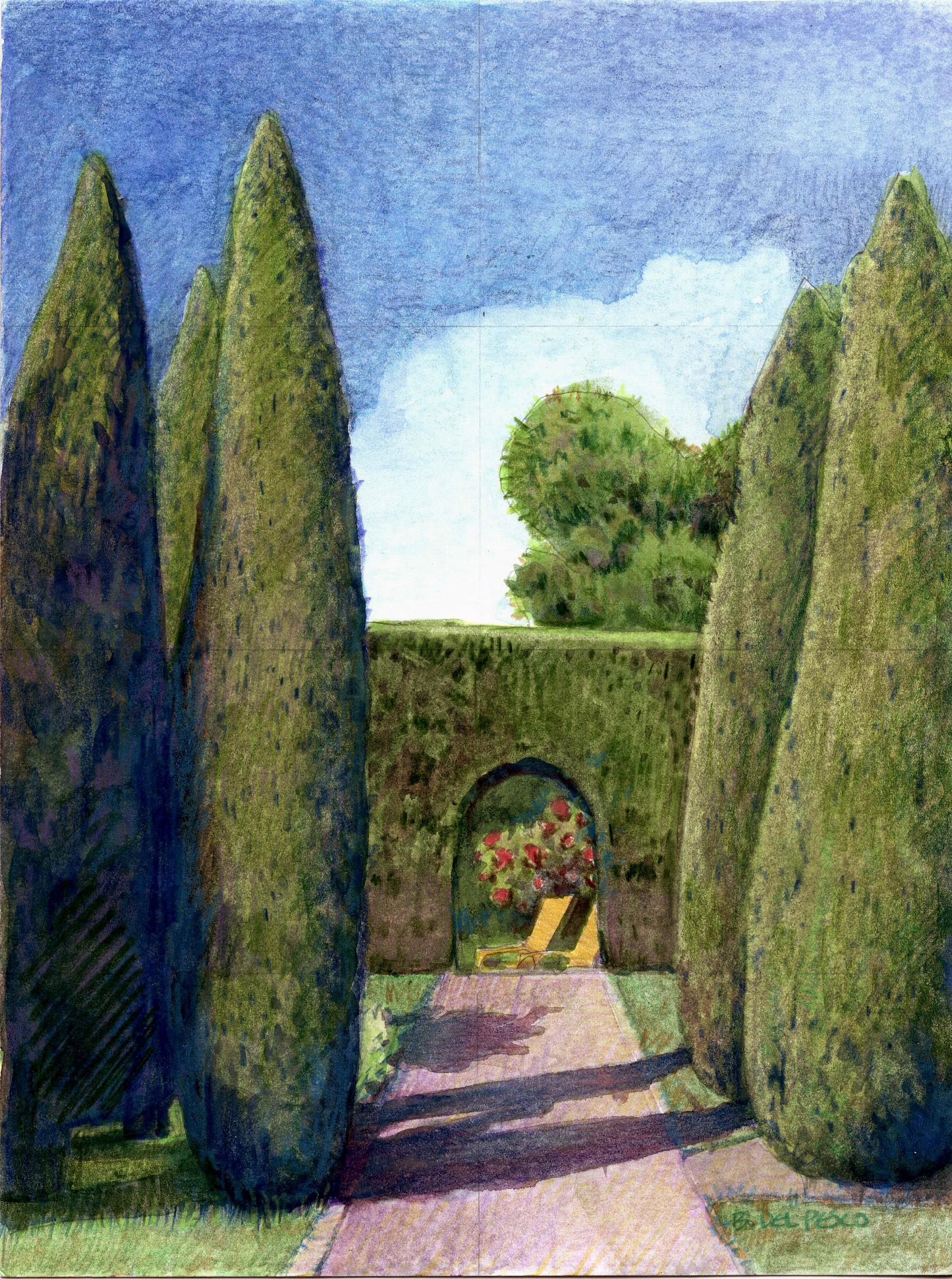
Layering and Blending Techniques That Work
Layering is the heart of colored pencil landscapes. Instead of pressing hard right away, build color slowly. This keeps the surface open for more detail and creates smoother transitions.
Basic Layering Process
- Start with light pressure
- Block in the biggest shapes
- Add midtones over the first layer
- Deepen shadows step by step
- Finish with accents and crisp details
This method works because light layers blend with the paper texture. As you add more layers, the scene becomes richer and more dimensional. If you press too hard too early, the surface can become shiny and hard to change.
Blending Options
You can blend colored pencil landscapes in several ways:
• Layering one color over another for optical mixing
• Using a colorless blender pencil for smoother transitions
• Applying light pressure with a white or pale pencil
• Rubbing lightly with a blending tool, if your paper allows it
I have found that the best blending often comes from patient layering, not aggressive smudging. Smudging can flatten texture and reduce control. For landscapes, you usually want a little texture left in the marks so grass, clouds, bark, and distant trees still feel alive.
How to Draw Skies, Clouds, and Atmosphere
Skies set the mood of the whole scene. In colored pencil landscapes, the sky is often the quiet force that makes everything else feel believable. A flat sky can weaken even a strong foreground.
Drawing the Sky
Use soft pressure and smooth strokes. Work in broad passes instead of tiny marks. For a clear day, blend blues with pale warm tones near the horizon. For sunset, layer peach, pink, lavender, and soft gold in thin layers.
Drawing Clouds
Clouds should not look like stickers. They need soft edges, shape changes, and subtle shadow. Try these tips:
• Leave some paper showing for bright cloud tops
• Build shadows with light gray, blue, or lavender
• Soften one edge to suggest movement
• Keep clouds varied in size and shape
Atmosphere matters too. Distant skies usually look lighter and less saturated. This is a key depth cue in colored pencil landscapes and one that beginners often miss. If the far distance is too dark or too sharp, the whole scene can feel crowded.
Trees, Grass, and Foliage in Colored Pencil Landscapes
Vegetation gives landscapes their life. But it is easy to overdraw every leaf and blade. The trick is to suggest detail where it matters and simplify where it does not.
Trees
Start with the trunk and main branches. Then build masses of leaves or needles as grouped shapes, not single dots. Use darker shadow on one side to create form. In the foreground, you can add more bark texture and sharper edges.
Grass
Grass works best when you vary stroke direction and length. Avoid repeating the same blade shape across the whole area. Mix greens with yellow, brown, and gray to keep it natural.
Foliage
For bushes and treetops, think in clusters. A cluster has light, middle, and dark areas. That structure creates volume. If every part is the same tone, the foliage will look flat.
A mistake I used to make was drawing every leaf with too much care. The result looked stiff, like lace instead of nature. Once I started drawing shapes of foliage instead of counting leaves, my colored pencil landscapes became much stronger.
Mountains, Rocks, and Distant Forms
Mountains and rocks are great subjects because they rely on shape and shadow more than tiny detail. That makes them ideal for colored pencil landscapes.
Distant mountains should usually look softer, lighter, and cooler. Use less contrast and fewer hard edges. Nearby rock faces can be darker and more textured, with sharper shadows and stronger color changes.
To make stone feel real:
• Watch the direction of light
• Group shadows into large shapes
• Mix cool grays with warm browns
• Add edge breaks so the rock does not look cut out
This kind of shape thinking is backed by basic visual perception principles used in art and design. We read depth from contrast, edge sharpness, and color temperature. That is why distant forms usually look hazier and less detailed than close ones.
Water, Reflections, and Wet Surfaces
Water can be one of the most beautiful parts of colored pencil landscapes, but it needs restraint. A river, lake, or ocean surface should show calm shape changes, not random scribbles.
For still water:
• Use smooth horizontal strokes
• Mirror major shapes softly
• Keep reflections darker than the sky in some areas
• Break up reflections with small color shifts
For moving water:
• Suggest motion with layered strokes
• Add lighter highlights where light catches the surface
• Use cooler tones in shadowed areas
• Avoid outlining each wave
Wet rocks, puddles, and shoreline areas also work well in colored pencil landscapes because they let you show contrast between matte and shine. The key is to keep the surface believable without overworking it.
How to Create Depth and Distance
Depth is what makes a landscape feel wide and real. Without depth, even a beautiful scene can look flat on the page. Colored pencil landscapes depend heavily on depth cues because the medium is so precise.
Use these principles:
• Make distant objects lighter and cooler
• Reduce detail in far areas
• Keep foreground contrast stronger
• Overlap shapes to show space
• Use perspective in roads, fences, and rivers
This is one reason atmospheric perspective matters so much. When I teach or demonstrate colored pencil landscapes, I often say that distance should feel like it is breathing. The farther away something is, the softer and quieter it becomes.
Common Mistakes to Avoid
Even experienced artists make errors with colored pencil landscapes. The good news is that most of them are easy to fix once you see the pattern.
Common mistakes include:
• Pressing too hard at the start
• Using too many bright colors at once
• Making every area equally detailed
• Ignoring light direction
• Forgetting to plan the composition
• Using paper that cannot hold enough layers
Another common issue is overblending. While smooth shading can be beautiful, too much blending can erase texture and make the scene look dull. A good colored pencil landscape usually keeps a mix of smooth passages and visible pencil marks.
A Simple Step-by-Step Process for Beginners
If you are new to colored pencil landscapes, keep your process simple. Trying to do everything at once usually leads to frustration. A slow, repeatable method builds confidence.
Step 1: Sketch the basic shapes
Lightly map the horizon, major landforms, trees, and water. Keep the sketch loose and simple.
Step 2: Block in the sky and distance
Start with the sky and far background. These areas usually need the softest treatment and set the overall mood.
Step 3: Build midground forms
Add hills, trees, or rocks in the middle of the scene. Use medium pressure and begin defining structure.
Step 4: Develop the foreground
This is where detail becomes stronger. Add grasses, stones, roots, or texture to create a sense of closeness.
Step 5: Deepen shadows and accents
Finish by strengthening the darkest darks and brightest highlights. These contrast points help the colored pencil landscape feel complete.
Benefits of Working in Colored Pencil Landscapes
There are many practical and creative benefits to this medium. Colored pencil landscapes are not just relaxing; they also teach strong drawing habits.
Some major benefits include:
• Better observation of light and color
• Stronger control over detail and edge work
• Improved patience and layering skills
• Easy correction compared with many paint methods
• Portable setup for travel or outdoor sketching
Many artists also find that this medium helps them slow down. That can be a real advantage in a world where everything feels rushed. Colored pencil landscapes invite you to notice how light sits on grass, how shadow cools a hill, and how a cloud changes the whole mood of a view.
Limitations to Keep in Mind
Colored pencil landscapes are excellent, but they do have limits. Being honest about those limits helps you choose the right approach.
Some limitations include:
• Large areas can take a long time to fill
• Heavy layering can flatten paper texture
• Very bright light effects may be harder than with paint
• Some pencils do not blend well
• Cheap paper can ruin smooth layering
That does not mean the medium is weak. It just means the artist has to work with it instead of against it. Once you understand its strengths, colored pencil landscapes become far easier and more enjoyable.
Practical Tips from Real Studio Use
After many landscape studies, I have a few habits that consistently help.
• Test colors on scrap paper before committing
• Keep a small value sketch nearby
• Step back often to check balance
• Save your darkest darks for the end
• Use soft layers to keep your options open
• Photograph your work in progress to spot problems
One of the best habits I ever built was taking a short break before final details. A fresh look often reveals weak areas in the sky, uneven tree spacing, or shadows that need more depth. It is a small habit, but it saves a lot of work.
Frequently Asked Questions About Colored Pencil Landscapes
What makes colored pencil landscapes different from other pencil drawings?
Colored pencil landscapes use layered color to show depth, mood, and texture in natural scenes. They often focus more on atmosphere and light than on strict outlines.
Can beginners make good colored pencil landscapes?
Yes, beginners can make strong colored pencil landscapes with simple shapes and light layering. Starting with a small scene, like a hill, tree, and sky, is often the best way to build skill.
What paper is best for colored pencil landscapes?
A medium-textured, acid-free paper usually works well because it holds layers without getting too slick. Very smooth paper can limit layering, while rough paper can make fine detail harder.
How do I make distant mountains look far away?
Use lighter values, cooler colors, and softer edges for distant mountains. Reducing detail also helps them recede into the background naturally.
Why do my colored pencil landscapes look flat?
Flat results usually come from weak contrast, similar values across the whole page, or too much detail in every area. Try strengthening shadows, softening the distance, and giving the foreground more texture.
Conclusion
Colored pencil landscapes are a beautiful mix of patience, skill, and observation. When you focus on layering, value, color temperature, and depth, the scene starts to feel alive without losing the softness that makes this medium so appealing.
The best results come from simple habits done well: plan your composition, build color slowly, and let the landscape breathe. If you want to improve fast, pick one scene this week and apply these ideas step by step. Keep practicing, keep studying nature, and share your finished work or favorite colored pencil landscape tips with others who love the medium.