
Color saturation is the strength or purity of a color, and it changes how vivid or muted it looks.
Color saturation is one of those design ideas that feels simple at first, but it shapes almost everything you see on a screen, in print, and in photos. When you understand how color saturation works, you can make better choices in branding, editing, art, and visual content. I’ve seen small changes in color saturation turn a flat image into something polished, emotional, and far more convincing.

What Color Saturation Means
Color saturation describes how intense a color appears. A highly saturated color looks rich, bold, and vivid. A low-saturation color looks softer, grayer, and more muted.
In simple terms, saturation tells you how much gray is mixed into a color. The less gray, the more vivid the color feels. The more gray, the more washed out it looks.
You can think of color saturation like the volume of a sound. High saturation is loud and bright. Low saturation is quiet and soft.
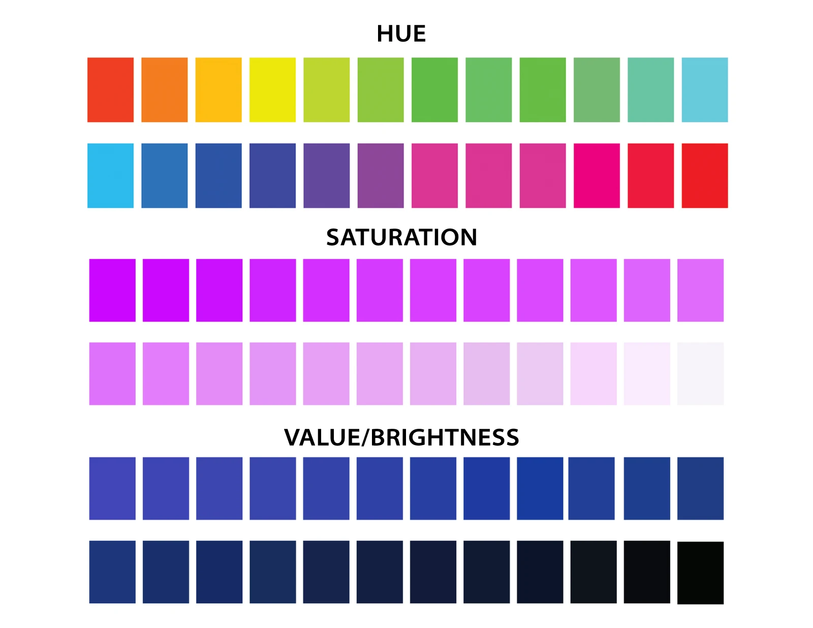
Color saturation is one of the three core parts of color, along with:
- Hue, which is the color family itself, like red, blue, or green
- Lightness or brightness, which tells you how light or dark the color is
- Saturation, which tells you how pure or intense the color is
This matters because two colors can share the same hue and brightness but still feel completely different if their saturation changes. That difference is huge in design and photography.

Why Color Saturation Matters
Color saturation affects mood, clarity, and attention. That is why it matters in so many fields, from marketing to photography to interior design.
A saturated color grabs the eye fast. A muted color tends to feel calm, elegant, or serious. Neither is better in every case. The right choice depends on the message you want to send.
Here is how color saturation changes perception:
- High saturation can feel energetic, playful, urgent, or youthful
- Medium saturation often feels balanced and natural
- Low saturation can feel calm, premium, vintage, or understated
I’ve worked on projects where the only fix needed was reducing saturation by a small amount. The whole image suddenly felt more expensive and easier on the eyes. That is the kind of subtle power saturation has.
Color saturation also affects readability. When colors are too strong, they can clash and strain the eye. When they are too weak, the design may feel flat or lifeless. Good work usually sits in the middle, where the color supports the message instead of fighting it.

How Color Saturation Works in Real Life
Color saturation is not just a design term. You see it every day in photos, clothing, packaging, makeup, websites, and even nature.
A bright red apple on a green tree looks highly saturated because the color is clean and strong. A dusty rose wall looks less saturated because it has more gray in it. A foggy morning landscape can look low in saturation because the light is soft and color is naturally reduced.
In digital work, saturation is often controlled with editing tools. You can increase it to make a product pop. You can decrease it to create a moody or realistic look.
Common situations where color saturation changes the result:
- Product photos need enough saturation to look appealing, but not so much that they look fake
- Social media graphics often use stronger saturation to stand out in busy feeds
- Portraits usually need careful saturation so skin tones stay natural
- Film and video often use lower saturation for a cinematic feel
- Brand design may use controlled saturation to build trust and consistency
One mistake I made early in my career was pushing saturation too far because I wanted the design to “look exciting.” It did look exciting, but it also looked cheap. That lesson stuck with me: color saturation works best when it supports the content, not when it shouts over it.
Color Saturation in Design and Branding
Brand teams care a lot about color saturation because it affects identity. A bright brand palette can feel bold and modern. A muted palette can feel refined and mature.
For example, a children’s brand may use vivid saturation to feel fun and friendly. A luxury skincare brand may use softer saturation to feel calm and premium. The color choice is part of the brand’s voice.
When choosing saturation for branding, think about:
- Audience age and taste
- Industry expectations
- Emotional tone
- Where the brand will appear
- How the colors work across print and digital media
A smart branding system usually includes a range of saturation levels. That gives the brand flexibility without losing consistency. A main color may be vivid, while secondary colors stay softer so the layout does not feel too loud.
If you are building a brand, do not pick colors based on trend alone. Trends fade. Color saturation should match the long-term feeling you want people to associate with your name.

Color Saturation in Photography and Video
In photography, color saturation can make a scene feel alive or dull. It can also help direct attention to the subject.
A sunset with rich saturation may feel dramatic and warm. The same scene with lower saturation may feel calm and reflective. This is one reason photographers often adjust saturation during editing.
A few practical tips I’ve learned from editing:
- Increase saturation carefully in skies and landscapes, since they can handle more color
- Be cautious with skin tones, because too much saturation can make people look unnatural
- Watch for color clipping, where bright colors lose detail
- Adjust saturation alongside contrast and exposure for a better final result
Video editors use the same idea. Too much saturation can look flashy or harsh, especially on large screens. Too little can make footage feel flat. Color grading tools often let you control saturation separately for the whole image or for specific color ranges.
That control matters because different colors react differently. Reds can overpower a shot quickly. Blues can deepen a scene. Greens can make outdoor footage feel fresh and natural.

Saturation, Hue, and Brightness: The Difference
People often confuse saturation with hue or brightness, but they are not the same thing.
Here is the simplest way to separate them:
- Hue is the color itself
- Saturation is how vivid or muted it is
- Brightness is how light or dark it is
For example, a blue color can be:
- Bright blue
- Dark blue
- Muted blue
- Highly saturated blue
All of those still belong to the blue hue, but their look changes because saturation and brightness are different.
This distinction matters in color correction and digital design. If a color feels “too loud,” the fix may not be brightness. It may be saturation. If a color feels too dark, the issue may be lightness instead.
Once you learn to see these as separate controls, your color choices get much more precise. That is a big step for anyone working in visuals.
What Affects Color Saturation
Several things can change how saturation appears to the eye.
These are the most common factors:
- Lighting: Bright light can make colors feel stronger or weaker depending on the source
- Surrounding colors: A color can look more saturated next to gray or less saturated next to a stronger color
- Screen calibration: A poorly calibrated display can make colors look too vivid or too dull
- Print material: Paper type and ink quality change how saturation appears
- Compression: Online images can lose color quality after being uploaded or resized
This is why a color may look perfect on one screen and different on another. It is also why professional workflows often include color checks before final delivery.
If you have ever edited a photo and then felt disappointed after uploading it, saturation may be part of the reason. The file might have changed during export, or the screen may be displaying it differently than expected.
How to Adjust Color Saturation the Right Way
Adjusting color saturation is easy, but adjusting it well takes practice. Small changes often work better than dramatic ones.
A simple process I recommend:
- Start with a neutral version of the image or design
- Increase or decrease saturation slowly
- Compare the result with the original
- Check skin tones, product colors, and text contrast
- View the result on more than one screen if possible
Good saturation editing is usually invisible. People should feel the result, not notice the edit itself.
A few tips to keep in mind:
- Use lower saturation when you want a calm or premium feel
- Use higher saturation when you want energy or urgency
- Protect natural colors, especially in people and food
- Avoid making every color equally strong
- Let one or two colors lead the composition
This is one of the most useful lessons I’ve learned: strong saturation is like strong seasoning. A little can improve the dish. Too much ruins it.
Benefits of Using Color Saturation Well
When color saturation is handled with care, the results can be powerful.
Main benefits include:
- Better visual focus: Saturation helps guide the viewer’s eye
- Stronger emotion: Color can shape how people feel
- Better brand recognition: Consistent saturation supports identity
- More polished images: Balanced colors look more professional
- Clearer storytelling: Color helps set tone and mood
In marketing, this can improve engagement because the visual message becomes easier to feel. In photography, it can make the subject stand out. In design, it can help users move through a layout more smoothly.
The biggest benefit, in my view, is control. Saturation gives you a quiet but effective way to shape meaning without adding more words.
Limitations and Common Mistakes
Color saturation is useful, but it has limits. Too much saturation can make a design feel fake, noisy, or hard to trust.
Common mistakes include:
- Over-editing photos until skin looks orange or red
- Using bright colors everywhere, which reduces contrast and focus
- Ignoring color consistency across devices
- Making brand colors so muted that they lose impact
- Confusing saturation with brightness and fixing the wrong thing
Another limitation is accessibility. Very strong saturation can be uncomfortable for some users, especially when paired with poor contrast. Web design should always consider readability and comfort.
There is also a cultural side to color. Some audiences respond differently to bold or muted palettes based on context, region, or tradition. That is why color choices should be tested when possible instead of assumed.
Practical Examples of Color Saturation
Here are a few everyday examples that make the idea easier to picture:
- A sports ad often uses high saturation to create energy and motion
- A wellness app may use soft saturation to feel peaceful and trustworthy
- A vintage-style photo often uses lower saturation to create nostalgia
- A food photo may use moderate saturation so ingredients look fresh but real
- A corporate report may use restrained saturation to stay clean and professional
You can also see saturation changes in home decor. A bright yellow chair can become the center of a room. A pale beige chair blends in more quietly. The same shape, the same size, but a very different feeling.
That is the power of color saturation: it changes the emotional weight of a visual without changing the object itself.
Frequently Asked Questions of color saturation
What is color saturation in simple terms?
Color saturation is how strong or pure a color looks. High saturation means a color looks vivid, while low saturation means it looks muted or grayish.
Is saturation the same as brightness?
No, they are different. Saturation is about color intensity, while brightness is about how light or dark a color appears.
Why do photos look different after uploading online?
Images can change during compression, resizing, or platform processing. That can reduce saturation or shift colors slightly, especially if the screen is not calibrated.
Does high saturation always look better?
No, not always. High saturation can be useful for attention and energy, but too much can look unnatural or overwhelming.
How do I make colors look more professional?
Use saturation with restraint, test your design on different screens, and keep colors consistent with the mood you want. Small adjustments often look more polished than extreme ones.
Conclusion
Color saturation is one of the simplest color tools to learn, but also one of the most powerful. It shapes mood, focus, style, and trust in ways people notice even when they cannot name why.
The best results usually come from balance. Use stronger saturation when you want energy and softer saturation when you want calm, then refine until the color feels right for the message. If you start paying attention to saturation in photos, brands, and everyday visuals, your eye will get sharper fast.
Try reviewing one image or design today and adjust only the saturation. You may be surprised by how much the whole piece improves. If you found this helpful, keep exploring color theory and share your own experience with saturation in the comments.