
Color temperature is the measure of how warm or cool a light source looks to our eyes.
Color temperature plays a bigger role in daily life than most people realize. It shapes how a room feels, how a photo looks, and even how alert or relaxed you feel under a lamp. In this guide, I’ll break down color temperature in a simple, practical way, based on real-world lighting experience and what actually matters when you choose bulbs, set up a workspace, or improve your photography.
What color temperature means
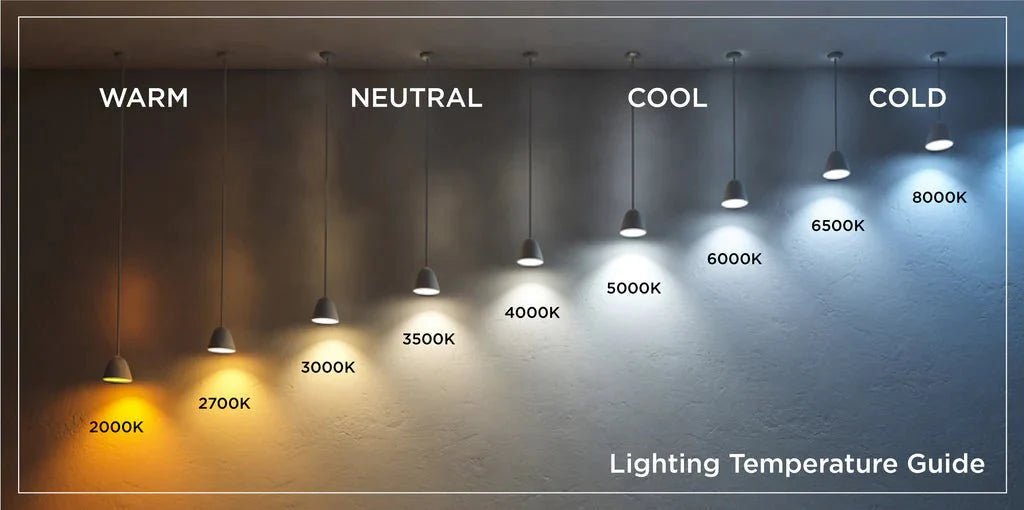
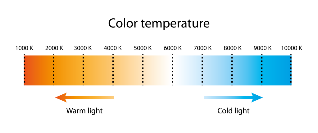
Color temperature is measured in Kelvin, often written as K. It describes the visual tone of light, from warm amber to cool blue-white. Lower Kelvin numbers look warmer, while higher numbers look cooler.
A common mistake is thinking warm light means high heat. It does not. In lighting, warm usually means softer, more yellow or orange light. Cool usually means sharper, more blue-white light.
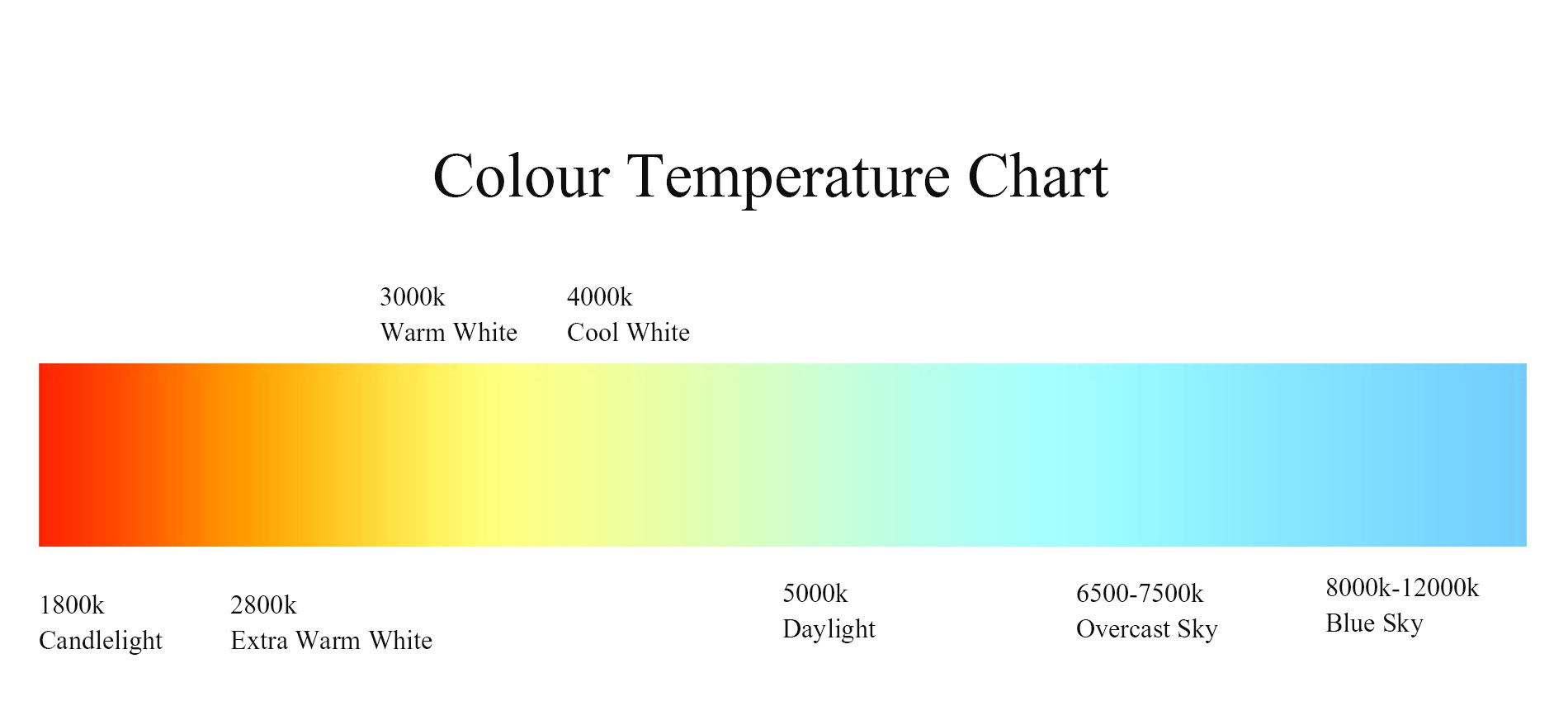
Here is the basic range most people use:
• 2200K to 2700K: very warm, candle-like light
• 3000K to 3500K: warm white light
• 4000K to 4500K: neutral white light
• 5000K to 6500K: cool white or daylight light
I learned this the hard way while helping a friend choose bulbs for a small apartment. The first set looked fine in the store, but at home they felt harsh and cold. We swapped them for 2700K bulbs, and the room instantly felt calmer and more livable. That is the real power of color temperature.
Why color temperature matters
Color temperature affects mood, comfort, and visibility. It can make a space feel cozy or clinical. It can also affect how accurate colors appear in photos, design work, and makeup application.
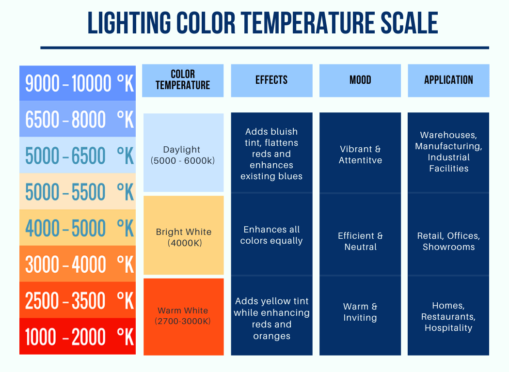
In homes, warmer light is often used for bedrooms and living rooms because it feels relaxing. Cooler light is often used in kitchens, offices, and garages because it helps with focus and detail.
A few practical ways color temperature matters:
• It changes the atmosphere of a room
• It affects how easy it is to read, work, or relax
• It can influence sleep when used at night
• It impacts how colors appear on skin, walls, and objects
• It helps set the right tone for photos and video
This is why lighting designers pay close attention to color temperature. A space can have beautiful furniture and still feel wrong if the light tone clashes with the room’s purpose.
Warm light vs cool light
Warm light and cool light are not about personal preference alone. They serve different jobs.
Warm light, usually between 2200K and 3000K, tends to feel soft and inviting. It works well in spaces where comfort matters more than task focus. Think living rooms, restaurants, and bedrooms.
Cool light, usually between 4000K and 6500K, feels brighter and more alert. It works better in places where clarity matters. Think office desks, kitchens, bathrooms, and workshops.
A simple way to remember it:
• Warm light = cozy, relaxed, intimate
• Cool light = clean, bright, focused
One tip from experience: do not judge a bulb only by brightness. Two bulbs can have the same lumen output but feel totally different because of color temperature. That difference can make or break a room.
Common color temperature ranges and where to use them
Different spaces work better with different Kelvin values. The right choice depends on the activity, the time of day, and the feeling you want to create.
2200K to 2700K
This range gives off a very warm glow. It is ideal for decorative lighting, bedside lamps, candle-style fixtures, and spaces made for rest.
Use it for:
• Bedrooms
• Dining areas
• Accent lighting
• Relaxing evening scenes
3000K to 3500K
This range still feels warm, but it is a little cleaner and more balanced. It is one of the most versatile choices for homes.
Use it for:
• Living rooms
• Hallways
• Hospitality spaces
• General home lighting
4000K to 4500K
This is neutral white light. It sits between warm and cool and gives a more natural, crisp look.
Use it for:
• Kitchens
• Home offices
• Bathrooms
• Retail spaces
5000K to 6500K
This range is cool and bright. It often resembles daylight and is useful when detail matters.
Use it for:
• Task lighting
• Workshops
• Photography setups
• Hospitals and labs
From a practical standpoint, I usually recommend homeowners stay near 2700K to 3000K for comfort, then use cooler tones only where extra clarity is useful. That balance usually feels the most natural.

How color temperature affects mood and sleep
Light affects the body more than many people expect. Cooler, brighter light can help you feel awake, while warmer light can help your body wind down.
At night, high color temperature light may make it harder to relax because it signals daytime to the brain. This is why many sleep experts and circadian rhythm researchers suggest using warmer light in the evening and avoiding harsh blue-heavy light before bed.
Helpful evening habits include:
• Using lamps instead of bright overhead lights
• Choosing 2700K bulbs for night use
• Reducing screen brightness after dark
• Turning off cool lights at least an hour before sleep
I have seen this make a real difference in homes with kids. When families switch from cool overhead lights to warmer lamps in the evening, bedtime often feels less chaotic. The room itself starts telling the body, “It is time to slow down.”
Color temperature in photography and video
In photography, color temperature is one of the most important tools for getting natural-looking images. Cameras need the right white balance to avoid faces looking too orange, too blue, or too green.
If a scene is lit by mixed light sources, the results can look odd fast. For example, daylight from a window and a warm lamp in the same shot can confuse the camera and create color casts.
Key photography tips:
• Match your light sources when possible
• Set white balance based on the main light source
• Use daylight-balanced lights for more control
• Avoid mixing very warm and very cool bulbs in the same frame unless intentional
I once worked on a product shoot where the subject looked clean on camera in one corner but yellow in another. The issue was not the camera. It was the mixed color temperature in the room. Once we standardized the lights, everything looked far more professional.
Color temperature in home design
Interior design depends heavily on color temperature. The same paint color can look soft under warm light and flat under cool light. Fabrics, wood finishes, and skin tones all shift depending on the lighting tone.
Designers often use layered lighting to make spaces feel better. That means combining ambient light, task light, and accent light with the right Kelvin values.
Smart design tips:
• Use warmer light in social and restful spaces
• Use neutral light where you need both comfort and visibility
• Keep color temperature consistent in one room
• Test bulbs at night, not just during the day
If you have ever bought a “white” bulb and later thought it looked blue, you are not alone. Store lighting often hides the true look of a bulb. Always test it at home before buying a full set.
How to choose the right color temperature
Choosing the right color temperature starts with the room’s purpose. Ask yourself what the space is for and how you want it to feel.
A simple process:
- Decide the main use of the room
- Think about the time of day you use it most
- Match the light tone to the mood you want
- Test the bulb in your actual room
- Compare it with your wall color, furniture, and natural light
A few easy rules help:
• Use warm light for relaxation
• Use neutral light for balance
• Use cool light for focus and detail
• Keep the same color temperature across similar fixtures when possible
One mistake I often see is people choosing the brightest bulb they can find and ignoring color temperature. Brightness matters, but the tone of the light often changes the room more than brightness alone.
Color temperature and LED lighting
LEDs made color temperature much easier to control. Most LED bulbs now come in multiple Kelvin options, from very warm to daylight white. Many also come in tunable versions, which let you change the tone as needed.
This is useful because one room may need different lighting at different times. For example, a kitchen may need cool light during meal prep and warmer light during dinner.
LED benefits include:
• Better energy efficiency
• Long lifespan
• More color temperature choices
• Dimmable and tunable options in many models
Still, not all LED bulbs are equal. Some lower-quality LEDs may flicker or show uneven color. That is why it helps to buy from reputable brands and look for consistent color rendering.
Color rendering and color temperature
Color temperature is not the same as color rendering. This is an important difference.
Color temperature tells you whether light looks warm or cool. Color rendering tells you how accurately that light shows colors. A bulb can be warm and still render colors well, or cool and still render colors poorly.
This is why professionals often check CRI, or Color Rendering Index, along with Kelvin. A high-CRI light usually makes skin, paint, food, and fabric look more natural.
Keep this in mind:
• Kelvin = light tone
• CRI = color accuracy
If you care about makeup, product photos, art, or design, both matter. In those cases, picking the right color temperature is only half the job.
Best practices for mixing color temperature
Mixing color temperatures can work, but it needs care. If you mix them badly, a room can feel messy or visually off.
A few good practices:
• Use one main color temperature in a room
• Add contrast only when it serves a purpose
• Match bulbs in visible fixtures
• Avoid placing a cool bulb next to a very warm one unless for design effect
In my experience, the safest move is to keep the same Kelvin range in all ceiling lights and use decorative lamps as accents. That gives the space a clean base and still leaves room for personality.
Frequently Asked Questions
What is the most natural color temperature for indoor lighting?
For many homes, 2700K to 3000K feels the most natural. It gives a warm but still clear light that works well for living spaces and evening use.
Is higher color temperature always better for work?
Not always. Higher color temperature can help with alertness, but too much can feel harsh or tiring. For most people, a neutral range like 4000K works better for long tasks.
Can color temperature affect sleep?
Yes, especially at night. Cooler light can make it harder for your body to relax, while warmer light is usually better before bed.
Why do some bulbs look different even at the same Kelvin rating?
Kelvin is only part of the story. Two bulbs with the same color temperature can still look different because of differences in CRI, brand design, and the room itself.
What color temperature is best for a bedroom?
Most bedrooms feel best around 2200K to 3000K. Warmer light creates a calmer mood and supports a more restful environment.
Conclusion
Color temperature is one of the simplest lighting ideas, but it has a huge effect on how we see and feel our spaces. It shapes mood, improves function, and changes how colors appear in everyday life. Once you understand the difference between warm, neutral, and cool light, choosing bulbs becomes much easier.
If you want better lighting, start by matching the Kelvin range to the room’s purpose. Test bulbs at home, trust your eyes, and do not ignore how the light feels at night. Small lighting changes can make a room feel completely new, so take a little time to get it right and explore more ways to light your space well.