
A color mixing chart shows how colors blend, shift, and create new hues in a simple visual guide.
A good color mixing chart can save time, reduce mistakes, and make your color choices feel more confident. I’ve used color mixing charts in painting, design, and client work, and the same lesson keeps showing up: when you understand how colors relate, everything gets easier. In this guide, I’ll walk you through the essentials of the color mixing chart, how it works, where it helps most, and how to use it in real life with practical examples.
What Is a Color Mixing Chart?
A color mixing chart is a visual guide that shows what happens when colors are blended together. It helps you predict new shades, tones, and tints before you mix them.
At its core, a color mixing chart is about relationships. It shows how primary colors, secondary colors, and tertiary colors interact. That makes it useful for painters, designers, teachers, crafters, and anyone who works with color.
A well-made color mixing chart often includes:
- Primary colors such as red, blue, and yellow in traditional art
- Secondary colors like orange, green, and purple
- Tertiary colors created by mixing a primary and a secondary color
- Shade, tint, and tone variations
- Warm and cool color families
In my own work, the color mixing chart has been one of the easiest tools to rely on when I needed fast color decisions. It’s a bit like a map for color. Instead of guessing, you can follow the chart and get much closer to the result you want.
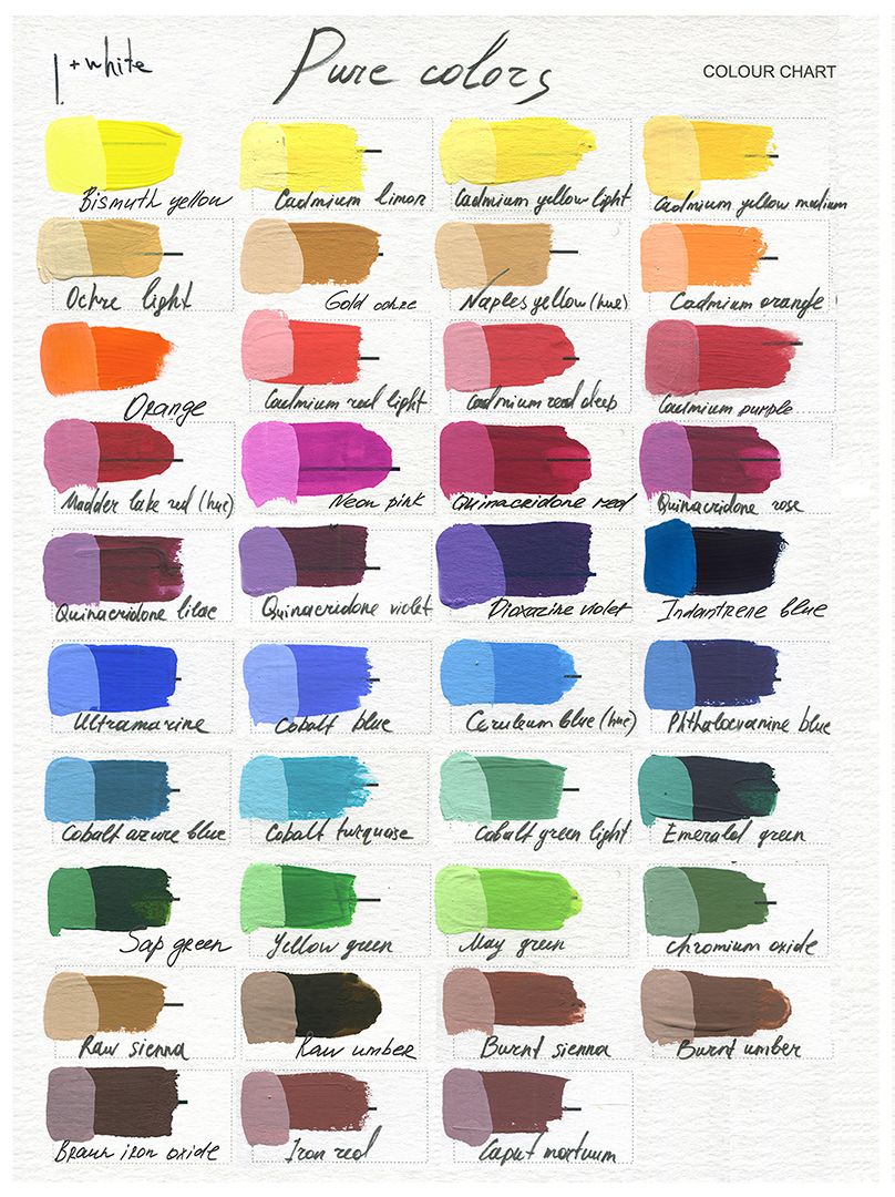
Why a Color Mixing Chart Matters
A color mixing chart matters because it removes a lot of guesswork. If you have ever mixed paint and ended up with muddy brown instead of the soft green you wanted, you already know why this matters.
The chart helps you:
- Save paint, ink, or dye
- Avoid waste
- Match colors more accurately
- Learn color theory faster
- Build confidence in creative projects
It also helps beginners understand a simple truth: colors do not mix the way many people expect. For example, mixing all colors together usually does not create a clean new color. It often creates a duller result because pigments absorb more light as more colors are added.
That is why artists and designers often keep a color mixing chart nearby. It turns trial and error into a more controlled process.
How a Color Mixing Chart Works
A color mixing chart works by showing color combinations in a grid or wheel format. Each row and column usually contains a base color. Where they meet, you see the result of mixing them.
Here is the basic idea:
- Mix two primary colors to get a secondary color
- Mix a primary with a secondary to get a tertiary color
- Add white to make a tint
- Add black to make a shade
- Add gray to make a tone
For example:
- Red + Yellow = Orange
- Blue + Yellow = Green
- Red + Blue = Purple
These simple combinations form the foundation of many color mixing charts. More advanced charts include exact ratios, such as 1:1 or 2:1, to show how the result changes as one color becomes stronger.
I learned early on that even a tiny change in ratio can shift the mood of a color. A little more yellow can make green feel fresh and lively. A little more blue can make it feel deeper and calmer.
Types of Color Mixing Charts
There are several kinds of color mixing charts, and the right one depends on your goal.
Traditional Artist Color Mixing Chart
This chart is often based on the red, yellow, and blue model. It is common in painting and art classes because it is simple and easy to understand.
It is useful for:
- Acrylic paint
- Watercolor
- Gouache
- Classroom color theory
CMYK Color Mixing Chart
CMYK stands for cyan, magenta, yellow, and key black. This system is used in printing.
It helps you understand how:
- Print colors combine on paper
- Subtractive color mixing works
- Ink layers affect the final print result
RGB Color Mixing Chart
RGB stands for red, green, and blue. This system is used on screens.
It is useful for:
- Web design
- Digital art
- Video and display work
In RGB, colors mix through light, not pigment. That means the results behave differently from paint. White light is created when red, green, and blue light combine at full strength.
Paint-Specific Color Mixing Chart
This type is made for physical paint. It often includes brand-specific pigments and notes about opacity, staining, and transparency.
That matters because not all reds are the same. A cool red may mix differently than a warm red. This is one of those details that beginners often overlook.
Primary, Secondary, and Tertiary Colors
Understanding color mixing starts with the color families.
Primary Colors
Primary colors are the base colors used to create other colors.
In traditional art, they are:
- Red
- Yellow
- Blue
In printing, the primaries are:
- Cyan
- Magenta
- Yellow
In digital screens, the primaries are:
- Red
- Green
- Blue
Secondary Colors
Secondary colors are made by mixing two primary colors.
Examples in traditional art:
- Red + Yellow = Orange
- Yellow + Blue = Green
- Blue + Red = Purple
Tertiary Colors
Tertiary colors come from mixing a primary color with a secondary color.
Examples include:
- Red-orange
- Yellow-orange
- Yellow-green
- Blue-green
- Blue-purple
- Red-purple
A color mixing chart makes these families easier to see at a glance. It helps you understand that color is not random. It follows patterns, and those patterns are what make the chart so useful.
Understanding Tints, Shades, and Tones
A good color mixing chart does more than show basic combinations. It also helps you control the value and mood of a color.
Tint
A tint is made by adding white to a color. This makes the color lighter.
Example:
- Blue + White = Light blue
Shade
A shade is made by adding black to a color. This makes the color darker.
Example:
- Red + Black = Deep red or maroon
Tone
A tone is made by adding gray. This softens the color.
Example:
- Green + Gray = Muted green
This is one of the most useful parts of a color mixing chart because it shows how to create softer, brighter, or darker versions of the same color. I often use this when a color feels too strong. Instead of starting over, I adjust the tint or tone until it fits the project better.
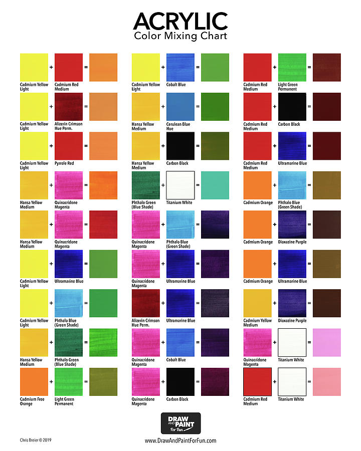
How to Read a Color Mixing Chart
Reading a color mixing chart is easier than it looks. Start by finding your base color. Then look across the chart to see what happens when it mixes with another color.
Here is a simple way to read it:
- Find the first color in one row
- Find the second color in one column
- Look at where they cross
- Check the resulting color in the chart
If the chart includes ratios, pay attention to them. A 1:1 mix is equal parts. A 2:1 mix means two parts of one color and one part of another.
Practical tip from experience: always test a small amount first. Even if the chart looks correct, the exact pigment or ink brand can shift the result. I’ve seen two paint brands produce noticeably different greens from the same yellow and blue mix.
Practical Uses of a Color Mixing Chart
A color mixing chart is useful in many settings, not just art class.
Painting and Fine Art
Painters use color mixing charts to plan palettes and avoid muddy colors. It helps them make clean skin tones, realistic shadows, and natural landscapes.
Graphic Design
Designers use color mixing charts to understand color harmony and screen-based color behavior. It also helps when building brand palettes or picking accent colors.
Printing and Publishing
Print work depends on predictable color output. A color mixing chart can help match inks, prepare proofing, and reduce printing errors.
Education
Teachers use color mixing charts to explain color theory in a visual way. Students often learn faster when they can see the result instead of just hearing the rule.
Crafts and DIY Projects
From resin art to candle making to fabric dye, a color mixing chart helps hobbyists control the final look of their work.
Common Color Mixing Mistakes to Avoid
A color mixing chart is helpful, but it does not remove all mistakes. Some errors are very common.
- Mixing too many colors together can create muddy results
- Using the wrong base color can change the whole outcome
- Forgetting the difference between paint and light leads to confusion
- Not testing the ratio first can waste materials
- Ignoring pigment strength can throw off the final mix
One mistake I made early in my career was assuming all blues were equal. They are not. A warm blue and a cool blue can behave very differently when mixed. Once I started labeling my paints and testing samples, my results improved fast.
Color Mixing Chart for Paint vs. Digital Color
The rules of a color mixing chart change depending on the medium.
Paint Mixing
Paint follows subtractive color mixing. More pigment usually means less reflected light. That is why mixing too many pigments can darken or dull the result.
Digital Mixing
Digital color follows additive color mixing. More light means a brighter result. This is how screens create vivid colors with RGB values.
Why This Difference Matters
If you use a paint chart for digital work, or a screen chart for paint, you will get confused fast. The medium changes the science behind the result.
That’s why a trustworthy color mixing chart should always match the material you are using.
Tips for Using a Color Mixing Chart Effectively
To get the best results, use the chart as a guide, not a guarantee.
- Keep a notebook of your own test mixes
- Write down exact ratios
- Label your paint or ink brands
- Mix in small batches first
- Compare dried colors, not just wet ones
- Work under consistent lighting
This last point matters a lot. Wet paint often looks brighter than dried paint. I’ve had colors look perfect on the palette, then shift once dry. A reliable color mixing chart should always be paired with real-world testing.
Benefits of Using a Color Mixing Chart
A color mixing chart offers both creative and practical benefits.
- Better control over color results
- Faster learning for beginners
- Less material waste
- Easier color matching
- More confidence in creative work
- Clearer understanding of color theory
It also makes your process smoother. Instead of feeling stuck, you can make decisions faster. That alone can save a lot of time on busy projects.
Limitations of a Color Mixing Chart
Even the best color mixing chart has limits.
- Pigment brands vary
- Lighting affects perception
- Screen color is not the same as print color
- Surface texture changes the result
- Some colors are harder to mix cleanly than others
For example, bright neon colors and highly saturated specialty pigments may not be easy to recreate with standard mixing rules. In those cases, the chart is still helpful, but you may need to experiment.
That is why I always say the chart is a guide, not a law. It gives you a strong starting point, but your materials and environment still matter.
Real-Life Example: Mixing a Natural Green
Let’s say you want a natural green for leaves.
You might start with yellow and blue, but the result may look too bright. If that happens, try these small adjustments:
- Add a little more blue for a deeper green
- Add a touch of red to mute it slightly
- Add white for a softer spring green
- Add gray for an earthy olive tone
This is where a color mixing chart becomes very practical. It helps you move from “close enough” to “just right.”
Frequently Asked Questions of color mixing chart
What is the purpose of a color mixing chart?
A color mixing chart shows how colors combine to make new shades, tints, and tones. It helps you predict results before you mix, which saves time and reduces mistakes.
Is a color mixing chart the same for paint and digital design?
No, because paint and digital color use different systems. Paint uses subtractive mixing, while digital screens use additive mixing, so the results are not the same.
Why do my mixed colors look muddy?
Muddy color often happens when too many pigments are blended together or when the base colors are not compatible. Using fewer colors and testing small batches can help keep mixes cleaner.
Can I make a color mixing chart at home?
Yes, and it is a great learning tool. Just use your own paints, inks, or digital colors, then record each mix carefully so you can repeat the results later.
What colors make brown on a color mixing chart?
Brown usually comes from combining complementary colors or mixing all three primary colors in the right balance. The exact brown depends on the pigments, so slight changes can make it warmer, cooler, or darker.
Conclusion
A color mixing chart is one of the simplest tools you can use to improve your color choices. It helps you understand how colors interact, how to create new shades, and how to avoid common mixing mistakes. Whether you work in paint, print, or digital design, the right chart can make your process easier and more accurate.
The best results come when you use the chart alongside real testing and careful observation. Start small, note what works, and build your own color reference over time. If you want better color results, take what you learned here and try it on your next project, then keep refining as you go.