
Colored pencil skin tones work best when you layer, observe undertones, and build color slowly.
If you want skin that looks alive on paper, colored pencil skin tones are one of the most rewarding skills to learn. I’ve found that the biggest difference is not the “right” pencil, but how you read light, warmth, shadow, and subtle color shifts in real skin. In this guide, I’ll walk you through the full process so you can create more natural colored pencil skin tones with confidence, whether you draw portraits, figures, or stylized characters.
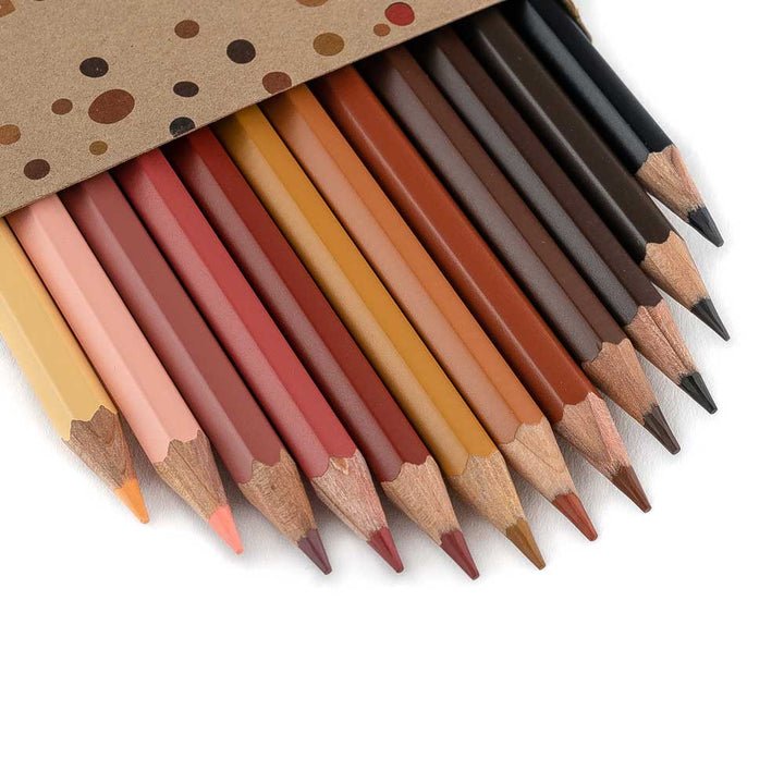
What makes colored pencil skin tones look realistic?
Realistic colored pencil skin tones come from layering, not one perfect color. Human skin is never flat or one-note. It reflects warmth, coolness, reds, yellows, blues, and soft grays depending on light and environment.
The trick is to stop thinking of skin as “peach” or “brown” and start seeing it as a mix of values and undertones. I learned this the hard way early in my portrait work, when every face I drew looked a little chalky because I used the same base color everywhere.
A more natural result usually depends on:
• Accurate value range, from highlights to deep shadows
• Careful layering of warm and cool tones
• Soft transitions instead of hard outlines
• Subtle color shifts in cheeks, lips, jawline, and under the eyes
• Light pressure so the paper texture still helps the drawing breathe
Colored pencil skin tones look most convincing when the artist treats skin like light passing through color, not paint laid on top of paper.
Understanding skin tone basics for colored pencil art
Before you choose pencils, it helps to understand how skin actually works. Skin tone is shaped by melanin, blood flow, lighting, and the surrounding colors in the scene. That means two people with similar skin can still look very different on paper if the light changes.
A common mistake is using only “skin tone” pencils and expecting realism. In practice, colored pencil skin tones need several families of color:
• Warm colors like peach, ochre, sienna, and red
• Cool colors like lavender, gray, blue, and muted green
• Neutral colors like beige, tan, and brown
• Deep shadow colors like dark umber, indigo, or charcoal tones
When I teach beginners, I often say this: skin is a conversation between warm and cool notes. If everything is warm, the face can look flat. If everything is cool, it can look lifeless.
Choosing the right colored pencils for skin tones
Not all pencils behave the same. Some are wax-based, some are oil-based, and some are harder or softer in feel. That matters because colored pencil skin tones often need smooth layering, clean blending, and enough control for details like lips, eyelids, and nostrils.
What to look for in a pencil set:
• Good layering ability
• Smooth color release
• A decent range of earth tones, reds, pinks, and grays
• Strong lightfastness if you plan to display the work
• A range of values from light to dark
In my own work, I’ve noticed that mid-range earth tones do most of the heavy lifting. Colors like light peach, burnt ochre, light umber, rose, and warm gray often carry the portrait farther than bright “flesh” colors ever will.
If you’re buying a small set, focus on versatility rather than quantity. A smaller palette used well can create more believable colored pencil skin tones than a huge set used blindly.
Building a skin tone palette that actually works
A strong palette is simple and flexible. You do not need dozens of pencils to make skin look real. You need a planned mix of lights, mids, shadows, and accents.
A practical skin-tone palette often includes:
• Light cream or ivory for highlights
• Peach or light beige for midtones
• Warm ochre or tan for transition areas
• Rose or muted red for cheeks and lips
• Light brown or sienna for deeper midtones
• Cool gray or lavender for shadows
• Dark brown or indigo for the deepest values
You can adjust this palette for different complexions. For fair skin, use softer peach, pink, and gray notes. For medium skin, build more ochres, browns, and muted reds. For deep skin, lean on rich browns, violets, blues, and warm darks instead of trying to “lighten” everything with white.
A lesson I learned through trial and error: avoid using white to “finish” the skin. White can flatten the drawing. It is usually better to preserve the paper for highlights or use a very light cream instead.
How to layer colored pencil skin tones step by step
Layering is the heart of colored pencil skin tones. Each layer should do one job. One layer may set the base tone, another may shift warmth, and another may deepen shadow.
Here is a simple process:
-
Start with a light base layer
Use gentle pressure and a light color close to the skin’s midtone. This helps you map the face without making the drawing too heavy too soon. -
Add warm and cool shifts
Place warmth on cheeks, nose, ears, and lips. Add cooler notes to the jaw, temples, and shadowed areas. -
Build values slowly
Deepen the shadows under the chin, around the eyes, and along the nose bridge. Keep the edges soft. -
Blend through layering, not rubbing
Use overlapping pencil strokes rather than pressing hard. This keeps the surface smooth and avoids waxy buildup. -
Finish with small color accents
Add tiny hints of red, violet, or green-gray where needed. These subtle changes make colored pencil skin tones feel alive.
I usually work from light to dark, but I also pause often to compare the portrait against the reference photo. That habit saves me from overworking a cheek or darkening a highlight too much.
How to match skin tone from a reference photo
Matching colored pencil skin tones to a reference photo is less about finding the exact pencil and more about reading what the light is doing. A reference photo can be misleading if the lighting is harsh, the camera filters are strong, or the white balance is off.
To study a reference well, ask yourself:
• Where is the main light source?
• Which areas are warmest?
• Which areas are coolest?
• Where are the darkest darks?
• Are the highlights soft or sharp?
A good trick is to squint at the photo. This helps simplify the face into big shapes of light and shadow. When I first started, I used to zoom in on tiny details too early. That almost always led to awkward faces because I lost the big value structure.
For the best results, try to draw from a reference with natural light and clear skin detail. Soft window light usually gives you better color information than flash photography.
Techniques for blending colored pencil skin tones
Blending is where many artists get stuck. Colored pencils do not blend like marker or paint, so you need patience. The good news is that controlled layering often creates a more natural skin surface than heavy blending ever could.
Useful blending techniques include:
• Layering similar hues in thin passes
• Using a colorless blender sparingly
• Burnishing only at the end
• Using light pressure throughout
• Cross-hatching with short, soft strokes
• Applying a light neutral pencil to smooth transitions
For skin, I usually avoid over-blending. When everything becomes too smooth, the portrait can lose its texture and look plastic. A little pencil grain can help skin feel real.
If the paper starts filling too fast, stop and step back. Overworking is one of the most common reasons colored pencil skin tones look dull.
Warm and cool shifts in skin tone
Skin is full of temperature changes. That is why colored pencil skin tones need both warm and cool color notes to feel believable. Even in a very warm complexion, shadows often lean cooler than the lit areas.
Here are some common temperature patterns:
• Cheeks, nose, and lips often carry warmth
• Shadowed jawlines may look cooler
• Under-eye areas may show muted blues or purples
• Forehead planes can shift between warm and neutral
• Neck shadows often appear cooler than the face
This is where colored pencil drawing becomes almost like music. Warm and cool notes play off each other. If you use only warm browns, the face can become muddy. If you place a soft violet or blue-gray in the shadows, the skin can suddenly feel more dimensional.
How to draw different skin tones with colored pencils
Colored pencil skin tones are not one-size-fits-all. Different complexions need different color relationships, but the same core principles still apply.
Fair skin tones
Fair skin often needs soft layering and very delicate color shifts. Use light peach, pink, beige, and cool gray tones instead of trying to force too much saturation.
Helpful ideas:
• Keep shadows gentle and transparent
• Use blush tones in cheeks and ears
• Add blue-gray or lavender in cool shadows
• Avoid overly orange colors unless the lighting supports it
Medium skin tones
Medium skin tones often benefit from stronger warmth and richer transitions. Ochres, siennas, rose browns, and muted reds usually work well.
Helpful ideas:
• Build with layered browns and golds
• Use red-brown notes around cheeks and lips
• Add cool shadows with blue-gray or violet
• Keep highlights soft and natural
Deep skin tones
Deep skin tones are rich, complex, and full of subtle color. One mistake artists make is using only dark brown. That usually makes the skin look flat.
Helpful ideas:
• Layer dark browns with violets, reds, and blue-grays
• Protect the highlights early
• Use deep shadow colors without making the drawing muddy
• Add luminous warmth in lit areas with care
In my experience, deep skin tones often look best when the artist thinks in color families, not just “darker” or “lighter.” There is a lot of beauty in the small shifts between warm browns, cool purples, and muted reds.
Common mistakes with colored pencil skin tones
Even experienced artists make skin-tone mistakes. The good news is that most of them are fixable.
Common problems include:
• Using one flat color for the entire face
• Pressing too hard too early
• Ignoring cool shadows
• Making highlights too white
• Over-blending until the skin looks lifeless
• Using outlines that are too dark and harsh
• Forgetting that skin changes with lighting
One of my biggest early mistakes was chasing color before value. I thought if I found the exact peach pencil, the portrait would work. It didn’t. The face only improved once I focused on light, shadow, and shape first.
Practical tips for better colored pencil skin tones
Here are a few tips that can improve your portraits right away:
• Work from light to dark
• Keep your pencil sharp for details
• Test colors on scrap paper first
• Use a reference with clear light direction
• Step back often to check the whole face
• Save the brightest highlights by leaving paper exposed
• Mix warm and cool colors in every portrait
• Use soft edges on cheeks and jawlines
If your portrait starts to feel stiff, soften the transitions around the cheeks, temples, and neck. Skin rarely has hard edges unless it’s against a strong shadow or sharp lighting.
Why paper choice matters for skin tones
Paper affects how colored pencil skin tones look more than many beginners realize. Smooth paper lets you layer fine details, while textured paper holds more pigment and creates a rougher finish.
A few things to consider:
• Smooth paper helps with portrait detail and even layering
• Medium texture gives more grip for multiple layers
• White or cream paper changes how skin colors appear
• Colored paper can help create mood and shadow depth
I’ve found cream-toned paper especially useful for skin studies because it softens the whole drawing from the start. It acts like a quiet middle ground, which helps skin tones feel warmer and less stark.
When to use blending tools and when to avoid them
Blending tools can help, but they are not a magic fix. Tortillons, colorless blenders, and solvents can smooth areas and speed up your process, yet they can also remove the handmade feel if used too much.
Use blending tools when:
• You need smoother transitions in larger areas
• You want to reduce visible stroke marks
• You are finishing a portrait and need polish
Avoid them when:
• You are still building values
• The paper is already saturated
• You want to preserve texture and detail
• The drawing starts to look overworked
For colored pencil skin tones, less is often more. A soft edge made with layers can look more natural than a heavily blended surface.
Frequently Asked Questions of colored pencil skin tones
What colors are best for colored pencil skin tones?
The best colors usually include peach, beige, ochre, sienna, rose, warm brown, cool gray, and violet. The exact mix depends on the person’s complexion and the lighting in your reference.
How do I make colored pencil skin tones look realistic?
Focus on value, undertones, and layering instead of using one “skin color” pencil. Realistic skin usually needs warm and cool shifts, soft edges, and gradual shadow buildup.
Can I use colored pencils for dark skin tones?
Yes, and they can look beautiful when handled well. Use rich browns, deep reds, violets, and blue-grays to build depth, and avoid flattening the skin with only one dark pencil.
Why do my colored pencil skin tones look muddy?
Muddy skin tones often come from over-layering too many colors, using too much pressure, or not planning values first. Try simplifying your palette and building color in thinner layers.
Do I need expensive pencils for good skin tones?
No, but higher-quality pencils usually layer better and give you more control. A smaller, well-chosen set can still produce excellent colored pencil skin tones if you understand color temperature and value.
Conclusion
Colored pencil skin tones become much easier when you stop looking for a single perfect color and start thinking in layers, values, and undertones. With the right palette, a light touch, and careful observation, you can make portraits feel warm, human, and full of life.
The biggest takeaway is simple: trust the process and build slowly. Practice on small studies, compare warm and cool shifts, and keep learning from real skin, not just from the pencil names on the box. If you want better results, try one new layering tip in your next portrait and see how much more natural your colored pencil skin tones can become.
Share your favorite skin-tone technique in the comments, and keep exploring more portrait drawing tips to sharpen your skills.