
A monochromatic color scheme uses one color and its shades, tints, and tones to create harmony.
A monochromatic color scheme is one of those design ideas that looks simple at first, but it can completely change how a space, brand, or image feels. I’ve used it in everything from web layouts to room palettes, and the biggest lesson is this: when it’s done well, it feels calm, polished, and intentional. When it’s done poorly, it can look flat or lifeless, so the details matter.
What Is a Monochromatic Color Scheme?
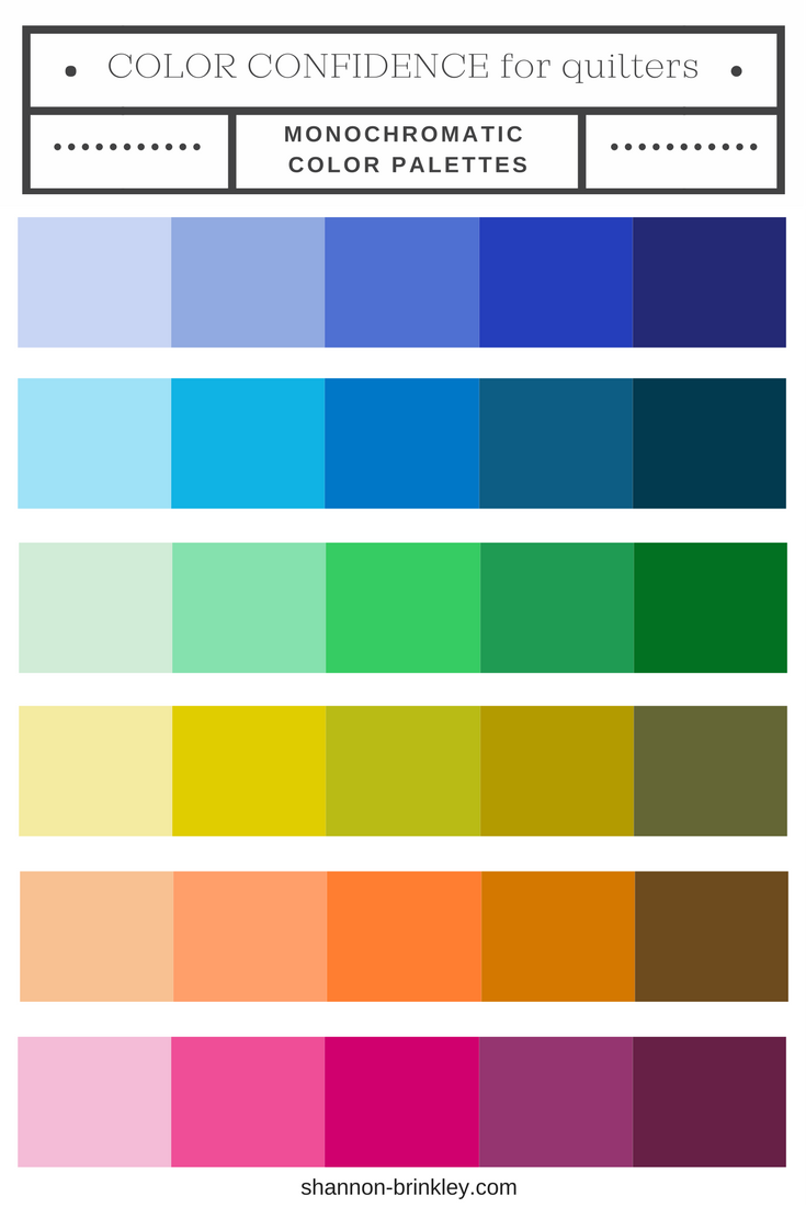
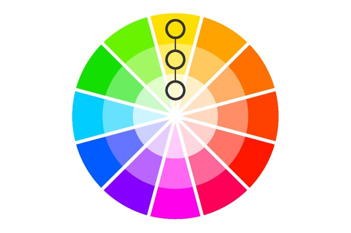
A monochromatic color scheme is a color palette built from a single base color. Designers then use lighter tints, darker shades, and softer tones of that same color to build depth and interest. This keeps the look unified while still giving the eye enough contrast to stay engaged.
In simple terms, monochromatic design is like telling one visual story in many voices. The message stays clear, but the mood can shift from soft and airy to bold and dramatic. That is why the monochromatic color scheme is popular in interior design, fashion, branding, photography, and digital interfaces.
How a Monochromatic Color Scheme Works
The core idea is easy: start with one base color and expand from there. The base color becomes the anchor, while the variations create structure. This makes the monochromatic color scheme feel organized and easy to use, even for beginners.
Here’s how the color variations work:
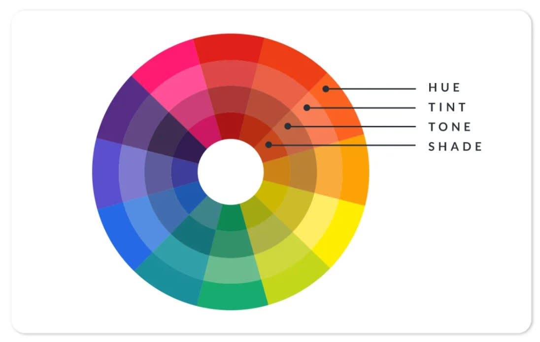
- Shade means adding black to the base color, which makes it darker.
- Tint means adding white to the base color, which makes it lighter.
- Tone means adding gray, which softens the color and makes it less intense.
For example, if your base color is blue, you can build a monochromatic color scheme with navy, sky blue, powder blue, and muted blue-gray. That range gives you contrast without leaving the same color family.
I’ve found this approach especially useful when a project needs calmness and clarity. It reduces visual noise and helps the viewer focus on shape, texture, layout, and detail instead of getting distracted by too many colors.
Why Designers Use a Monochromatic Color Scheme
A monochromatic color scheme is popular because it creates balance fast. It removes the guesswork that often comes with mixing many colors, and it gives the design a strong sense of unity. That is one reason you see it so often in modern branding and minimalist interiors.
Here are some of the biggest benefits:
- It creates harmony. Everything feels connected because all colors come from the same base.
- It looks polished. Even simple layouts can feel high-end and intentional.
- It is easier to control. You do not have to manage multiple competing hues.
- It supports focus. The viewer pays more attention to content, form, and texture.
- It works across many styles. You can make it soft, dramatic, elegant, or modern.
From my own work, I’ve noticed that clients often think they want “more color,” but what they really want is more life. A monochromatic color scheme can deliver that through contrast, spacing, and texture instead of rainbow-level saturation.
Key Elements of a Strong Monochromatic Palette
A good monochromatic color scheme is not just one color repeated again and again. It depends on smart variation. The more carefully you control those variations, the richer the final result will feel.
Value contrast
Value is the lightness or darkness of a color. Strong value contrast helps the design stay readable and lively. Without it, a monochromatic color scheme can look washed out.
Texture
Texture adds depth when color variety is limited. In interiors, that could mean linen, wood, metal, or matte paint. In digital design, it could mean photo overlays, shadows, gradients, or subtle patterns.
Saturation
Saturation controls how intense or muted a color feels. A fully saturated monochromatic palette can feel bold and energetic. A muted one can feel calm, soft, and sophisticated.
Proportion
Not every variation should appear equally. A dominant base color, a supporting mid-tone, and a small amount of dark or light contrast usually create the best balance. This is one of the easiest ways to keep a monochromatic color scheme from feeling repetitive.

Monochromatic Color Scheme in Interior Design
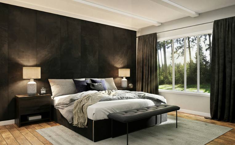
In interior design, a monochromatic color scheme can make a room feel spacious, peaceful, and coordinated. It is especially useful in small rooms because it creates visual flow instead of chopping the space into separate color blocks. The result often feels cleaner and more open.
Some practical examples include:
- A gray room with charcoal furniture, soft dove-gray walls, and silver accents
- A beige living room with cream walls, tan upholstery, and brown wood details
- A blue bedroom with navy bedding, pale blue walls, and slate accents
One mistake I’ve seen often is using only flat, same-level shades. If every item in the room has nearly the same value, the space can feel dull. The better move is to mix matte and glossy finishes, light and dark surfaces, and different materials to keep the eye moving.

Monochromatic Color Scheme in Graphic and Web Design
In digital design, a monochromatic color scheme can make a site feel clean and user-friendly. It also helps create visual consistency across buttons, backgrounds, icons, and typography. This can be especially helpful for portfolios, luxury brands, wellness sites, and editorial layouts.
A few smart uses include:
- A dark charcoal interface with lighter gray panels and white text
- A blue brand palette with different tones for headers, links, and backgrounds
- A green eco-brand design with soft sage, forest green, and muted mint
For web work, accessibility matters. A monochromatic color scheme should still meet contrast needs for readable text and clear buttons. Good design should look beautiful, but it also has to work for real people with real screens and real lighting conditions.
Monochromatic Color Scheme in Fashion and Photography
Fashion often uses a monochromatic color scheme to create a sleek, put-together look. Wearing different shades of the same color can make an outfit feel taller, cleaner, and more refined. It also makes styling easier because the palette already works together.
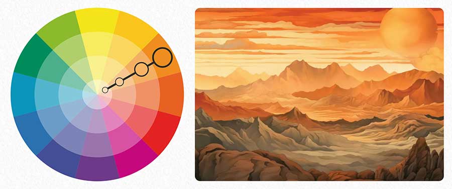
In photography, a monochromatic color scheme can create mood and focus. Warm sepia tones can feel nostalgic. Cool blue tones can feel quiet or cinematic. Black-and-white photography is one of the most famous examples, even though it technically uses neutral tones rather than color in the usual sense.
A helpful tip from experience: if you want a monochromatic outfit or photo to feel rich, mix fabrics or surfaces. Wool, denim, silk, cotton, and leather all reflect light differently, and that adds depth even when the color stays the same.

How to Build a Monochromatic Color Scheme
Building a monochromatic color scheme is easier when you follow a simple process. The goal is to create enough variety to feel complete without losing the unity that makes the style work.
Here is a practical method:
-
Pick one base color.
Choose a color that fits the mood you want. Blue feels calm, red feels bold, green feels fresh, and beige feels warm. -
Create lighter and darker versions.
Add white for tints, black for shades, and gray for tones. -
Test contrast.
Make sure text, objects, and background areas are still easy to see. -
Add texture or material variety.
Use patterns, finishes, or surface changes to keep things interesting. -
Check the full view.
Step back and see whether the design feels balanced, not crowded or flat.
I usually suggest starting with fewer steps than you think you need. Beginners often overbuild a palette and lose the simplicity that makes a monochromatic color scheme so effective.

Common Mistakes to Avoid
A monochromatic color scheme is simple, but that does not mean it is foolproof. Small mistakes can make the whole design feel unbalanced. I’ve made a few of these myself, and they are usually easy to fix once you spot them.
Avoid these common errors:
- Using too little contrast, which makes everything blur together
- Choosing only very bright colors, which can feel harsh
- Ignoring texture, which can make the design feel flat
- Forgetting accessibility, especially in digital layouts
- Overusing the exact same color value, which weakens depth
The biggest lesson is this: sameness is not the same as harmony. A strong monochromatic color scheme needs variation, or it loses its energy.
Psychology Behind a Monochromatic Color Scheme
Color influences how people feel, and a monochromatic color scheme can shape mood in subtle but powerful ways. Because the palette is controlled, it often feels calm, stable, and easy to process. That is one reason it is used in spaces meant for relaxation or focus.
Different base colors can trigger different emotional reactions:
- Blue can feel peaceful, thoughtful, or professional
- Green can feel natural, balanced, or restorative
- Gray can feel neutral, modern, or reserved
- Red can feel passionate, urgent, or energetic
- Beige can feel warm, soft, and welcoming
These reactions are not exact rules, but they are useful patterns. In my experience, clients respond strongly to monochromatic palettes when the color matches the purpose of the space or brand. The tone feels more honest when the color story supports the message.
Monochromatic Color Scheme vs. Other Color Schemes
It helps to compare monochromatic design with other common color strategies. This makes the strengths and tradeoffs easier to understand.
Monochromatic vs. complementary
A complementary color scheme uses opposite colors on the color wheel. It creates strong contrast and energy, while a monochromatic color scheme feels calmer and more unified.
Monochromatic vs. analogous
An analogous scheme uses colors next to each other on the color wheel. It has more variety than monochromatic design but still feels smooth and related.
Monochromatic vs. triadic
A triadic scheme uses three evenly spaced colors. It is more lively and complex, while monochromatic design is simpler and often more elegant.
If you want drama, contrast, and variety, another scheme may work better. If you want cohesion, clarity, and calm, the monochromatic color scheme is often the better choice.
Best Use Cases for a Monochromatic Color Scheme
A monochromatic color scheme works best when you want a focused, cohesive look. It is especially useful when the goal is to create a mood more than a burst of variety.
Common use cases include:
- Branding for luxury, wellness, or minimalist businesses
- Interior design for modern, small, or peaceful spaces
- Fashion looks that need elegance and simplicity
- Presentation slides that should feel clean and professional
- Editorial layouts where typography and spacing matter most
It is not always the best answer for playful, high-energy projects. Still, when handled well, a monochromatic color scheme can make even a simple project feel deliberate and memorable.
Frequently Asked Questions About Monochromatic Color Scheme
What is a monochromatic color scheme in simple words?
A monochromatic color scheme uses one color with different shades, tints, and tones. It creates a unified look without using multiple separate hues.
Is a monochromatic color scheme boring?
It can be boring if there is not enough contrast or texture. But with smart variation, it can feel elegant, calm, and visually rich.
What colors work best for a monochromatic scheme?
Any color can work, but blue, green, gray, beige, and black are popular choices. The best color depends on the mood you want and how the design will be used.
How do you keep a monochromatic design from looking flat?
Use value contrast, texture, and different finishes. Light and dark variations help create depth and keep the eye interested.
Is black and white considered monochromatic?
Yes, black and white can be considered a monochromatic style in practice, especially in design and photography. It relies on one neutral family with different light and dark values.
Conclusion
A monochromatic color scheme is one of the simplest ways to create a polished, balanced look. It works because it brings order, clarity, and visual calm, while still leaving room for depth and personality. When you use the right mix of shades, tints, tones, and texture, the result can feel much richer than people expect.
If you are designing a room, building a brand, or styling a visual project, try starting with one color and exploring its full range. You may be surprised by how much flexibility lives inside a single hue. Explore more color theory tips, test a palette in a real project, and share your results to keep improving your eye.