
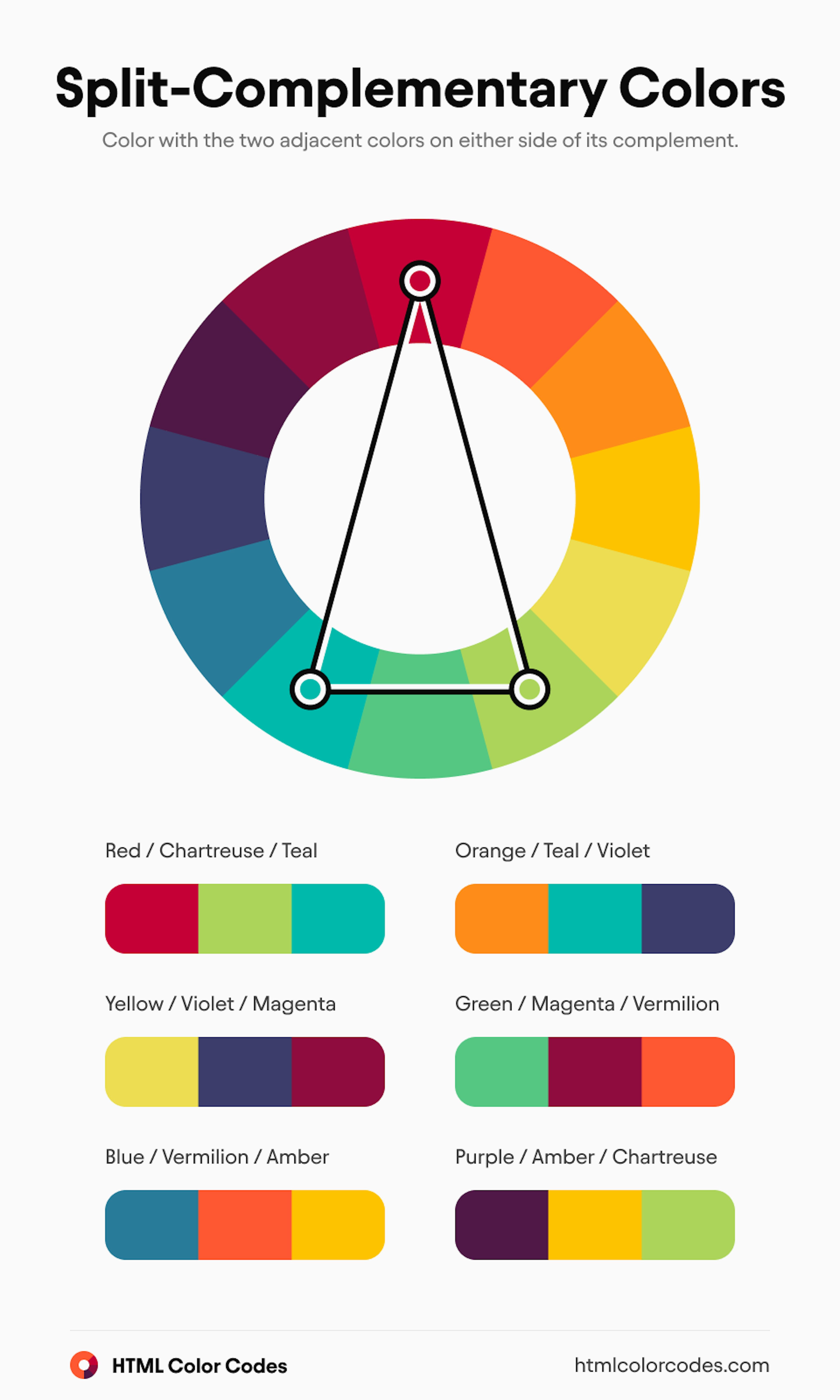
Split complementary colors use one base hue plus two colors beside its opposite on the color wheel.
Split complementary colors are one of those color ideas that look simple at first, then open up a whole new level of control once you start using them. If you have ever wanted contrast without the harshness of a true complementary pair, this scheme is a smart place to start. In this guide, I’ll break down how split complementary colors work, why designers love them, and how you can use them in real projects with more confidence.
What Are Split Complementary Colors?
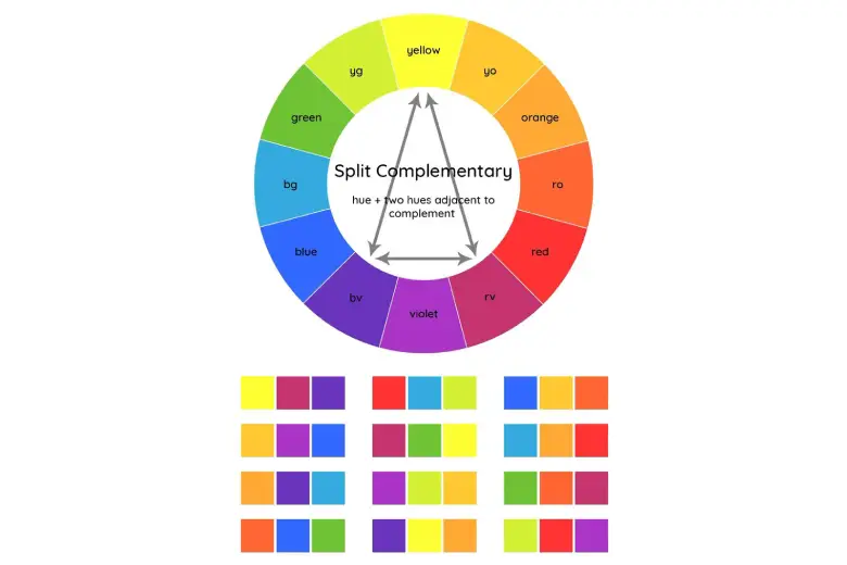
Split complementary colors are built from one base color and the two colors next to its direct complement on the color wheel. In plain English, you pick a color, find the color opposite it, and then use the two colors on either side of that opposite color.
This creates a palette that still has contrast, but it feels softer and easier to balance than a straight complementary scheme. That is why split complementary colors show up so often in graphic design, branding, illustration, interior design, and even fashion.
Here is the basic idea:
• Pick one main color
• Find its direct opposite on the color wheel
• Use the two colors on each side of that opposite color
For example, if your base color is blue, the direct complement is orange. A split complementary palette would use blue, yellow-orange, and red-orange.
I have used split complementary colors many times when a project needed energy but could not look too loud. In my experience, this palette is one of the easiest ways to make a design feel alive without making it feel chaotic.
Why Split Complementary Colors Work So Well
Split complementary colors work because they give you contrast and harmony at the same time. That balance is the real magic. You get enough difference to make key elements stand out, but not so much that the palette feels like a color fight.
The reason this works is visual tension. The base color anchors the design, while the two split colors create movement and interest. Your eye can travel across the palette without getting stuck on one jarring clash.
Some of the biggest benefits include:
• Strong contrast with less visual stress
• Easier color balance than a full complementary scheme
• More flexibility for accents and highlights
• Better depth in illustrations and layouts
• A polished look that still feels dynamic
From a practical point of view, this is why many designers reach for split complementary colors when they want a project to feel professional but not boring. It gives structure without feeling stiff.
How to Build a Split Complementary Color Palette
Building a split complementary palette is easier than most people think. You do not need advanced color theory to get started. You just need a color wheel and a little practice.
Follow these steps:
-
Choose your base color
Start with the color you want to lead the design. This is often the strongest or most important color in the palette. -
Find the direct complement
Look at the color straight across the wheel from your base color. -
Select the two neighboring colors
Use the colors on both sides of the complement instead of the complement itself. -
Decide your balance
Usually, one color should dominate. The other two should support it. -
Test value and saturation
Adjust lightness and intensity so the palette feels readable and not too loud.
A simple example:
• Base color: blue
• Split complements: yellow-orange and red-orange
Another example:
• Base color: green
• Split complements: red-orange and red-violet
When I first started using split complementary colors, my biggest mistake was treating all three colors as equal. That usually made the design feel busy. The better approach is to let one color lead and use the other two like supporting actors.
Split Complementary Colors vs Complementary Colors
Split complementary colors are related to complementary colors, but they do not behave the same way. That difference matters a lot when you are trying to control the mood of a design.
A complementary scheme uses two colors that sit directly opposite each other on the color wheel. This creates the strongest contrast and can feel bold, sharp, or dramatic.
A split complementary scheme replaces that opposite color with its neighbors. The result is still colorful and vibrant, but less intense and easier to work with.
Here is a quick comparison:
• Complementary colors: maximum contrast, higher tension
• Split complementary colors: contrast with more balance
• Complementary colors: better for bold statements
• Split complementary colors: better for flexible, layered designs
If you want a color scheme that is easier on the eyes, split complementary colors are often the better choice. If you want a loud focal point, complementary colors may be the stronger fit.
Best Ways to Use Split Complementary Colors in Design
Split complementary colors can be used in many creative fields. They are especially useful when you want color to support the message instead of overpowering it.
In graphic design
Split complementary colors work well in posters, social media graphics, infographics, and website hero sections. They help create hierarchy, so the viewer knows where to look first.
Use them for:
• Headline and button contrast
• Accent shapes and icons
• Charts and data highlights
• Brand visuals that need personality
In interior design
In home spaces, split complementary colors can create rooms that feel energetic but still livable. They are great when you want more personality than a neutral palette can offer.
A simple way to use them:
• Choose one wall or large piece as the main color
• Add the split colors through pillows, art, rugs, or decor
• Keep the rest of the room grounded with neutrals
In fashion
Fashion often uses split complementary colors to create looks that feel intentional and stylish. A jacket, top, and accessory combination can look more refined when the colors are related in this way.
In branding
Brands often use split complementary colors to stay memorable without becoming overwhelming. This palette can make logos, packaging, and campaigns feel modern and flexible.
How to Balance Split Complementary Colors
Balance is where many people struggle. The colors may look good on the wheel, but real-world use is different. Brightness, size, and placement all change the final result.
A useful rule is the 60 30 10 approach:
• 60 percent dominant color
• 30 percent secondary color
• 10 percent accent color
This is not a strict law, but it is a strong starting point. It keeps the palette from feeling scattered.
A few practical tips:
• Use the base color for the largest area
• Save the brightest color for accents
• Soften one or more colors if the palette feels too intense
• Add neutrals like white, gray, beige, or black for breathing room
• Check contrast for readability, especially in digital design
One lesson I learned the hard way is that saturation can make or break a split complementary palette. Even a good color scheme can look messy if every color is equally vivid. Small adjustments often make the biggest difference.
Common Mistakes to Avoid
Split complementary colors are forgiving, but they are not foolproof. A few common mistakes can weaken the whole effect.
Avoid these issues:
• Using all three colors in equal amounts
• Choosing colors that are too saturated at the same time
• Ignoring contrast and readability
• Forgetting to add neutrals
• Picking colors from memory instead of checking the wheel
Another mistake is using split complementary colors without considering the project goal. A playful palette can be great for a youth brand, but it may feel too lively for a law firm or financial site. Always match the palette to the message.
Real-Life Examples of Split Complementary Colors
It helps to see the scheme in action. Once you do, the logic becomes much easier to remember.
Example 1: Blue base
• Base color: blue
• Split colors: yellow-orange and red-orange
This combination feels energetic but stable. It is great for tech brands, educational graphics, and clean web layouts.
Example 2: Red base
• Base color: red
• Split colors: blue-green and yellow-green
This palette feels active and fresh. It can work well in food branding, sports graphics, or bold posters.
Example 3: Purple base
• Base color: purple
• Split colors: yellow-green and yellow-orange
This creates a rich, creative feel. It is often useful in beauty, art, and luxury-inspired visuals.
In my own projects, purple-based split complementary palettes often give the best “interesting but still elegant” result. That said, they need careful value control, or they can turn overly playful very fast.
Split Complementary Colors in Color Psychology
Color psychology is not exact science, but it does help explain why certain palettes feel the way they do. Split complementary colors often create emotional variety because they mix contrast with color harmony.
In many cases:
• The base color sets the mood
• The split colors add energy or warmth
• The overall scheme feels active but controlled
For example, a blue-based split complementary palette may feel trustworthy with a spark of excitement. A red-based one may feel bold and lively. A green-based one can feel natural while still drawing attention.
The key is not to overpromise with color psychology. Colors influence perception, but context matters too. Lighting, texture, typography, and content all shape the final experience.
How to Choose the Right Split Complementary Colors
Choosing the right palette depends on purpose, audience, and setting. There is no single best combination.
Ask yourself:
• What feeling should the design create?
• Which color should lead?
• Where will the palette be used?
• Do I need more energy or more calm?
• Will this palette be seen on screen, in print, or in a room?
If you are unsure, start with a muted version of the palette. Softer colors are easier to refine. Once the structure works, you can increase saturation if needed.
A good rule from experience: if the palette looks strong in grayscale values first, it usually works much better in color too.
Frequently Asked Questions
What are split complementary colors in simple terms?
Split complementary colors are a color scheme made from one base color and the two colors beside its opposite on the color wheel. This gives you contrast without the full tension of a direct complementary pair.
Are split complementary colors good for beginners?
Yes, they are a great choice for beginners because they are easier to balance than many other schemes. They give you structure, contrast, and flexibility without making the palette too harsh.
What is the difference between split complementary and triadic colors?
Split complementary colors use one base color and two colors next to its complement. Triadic colors use three colors spaced evenly around the color wheel, which usually creates a more evenly balanced but less focused look.
Can split complementary colors work in minimalist design?
Yes, they can work very well in minimalist design if you use them carefully. Keep one color dominant, use the others as accents, and add plenty of neutral space.
How do I know if my split complementary palette is working?
A good split complementary palette feels lively but still organized. If the colors compete too much, reduce saturation, adjust value, or make one color less prominent.
Conclusion
Split complementary colors are a smart way to bring contrast, energy, and balance into a design. They offer more flexibility than a direct complementary scheme, which makes them useful for everything from branding to interiors to digital art. When you choose one strong base color and let the two split colors support it, the result often feels more polished and easier to read.
If you are just starting out, keep it simple, test your values, and let one color lead the way. Try a few combinations, compare them side by side, and notice how small changes affect the mood. If this guide helped, keep exploring color theory, share your own favorite palette, or leave a comment with the split complementary colors you want to try next.