
A triadic color scheme uses three evenly spaced colors on the color wheel for balanced, lively contrast.
A triadic color scheme is one of the most useful tools in color theory because it gives you energy without chaos. I’ve used triadic palettes in branding, web design, and illustration, and the pattern is always the same: when the balance is right, the whole design feels bright, clear, and confident. In this guide, I’ll walk you through how a triadic color scheme works, when to use it, how to keep it harmonious, and the mistakes that can make it feel too loud.
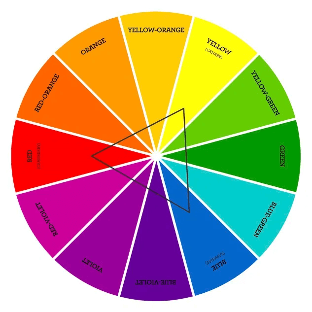
What Is a Triadic Color Scheme?
A triadic color scheme is a palette made of three colors that are evenly spaced around the color wheel. The most common example is red, yellow, and blue, but there are many other triads depending on the wheel you use.
This color scheme creates strong contrast while still feeling balanced. That is why designers often use it when they want a look that feels playful, bold, or full of life. A triadic color scheme gives you more variety than a monochromatic palette, but it is usually easier to control than a fully split or random mix of colors.
At its core, a triadic color scheme is about harmony through distance. The colors are far enough apart to stand out, but close enough in structure to work together.
How a Triadic Color Scheme Works
On a standard 12-step color wheel, each color in a triadic color scheme sits 120 degrees apart. That even spacing is what creates the natural balance. When one color feels warm, another may feel cool, and the third often acts as the bridge.
A simple example is:
- Red, yellow, and blue
- Orange, green, and purple
- Red-orange, yellow-green, and blue-purple
The exact colors you choose matter a lot. Pure hues can feel intense, while softened tints and shades can make the same triadic color scheme feel calm and modern. I’ve found that small changes in saturation often make the biggest difference in how usable the palette feels.
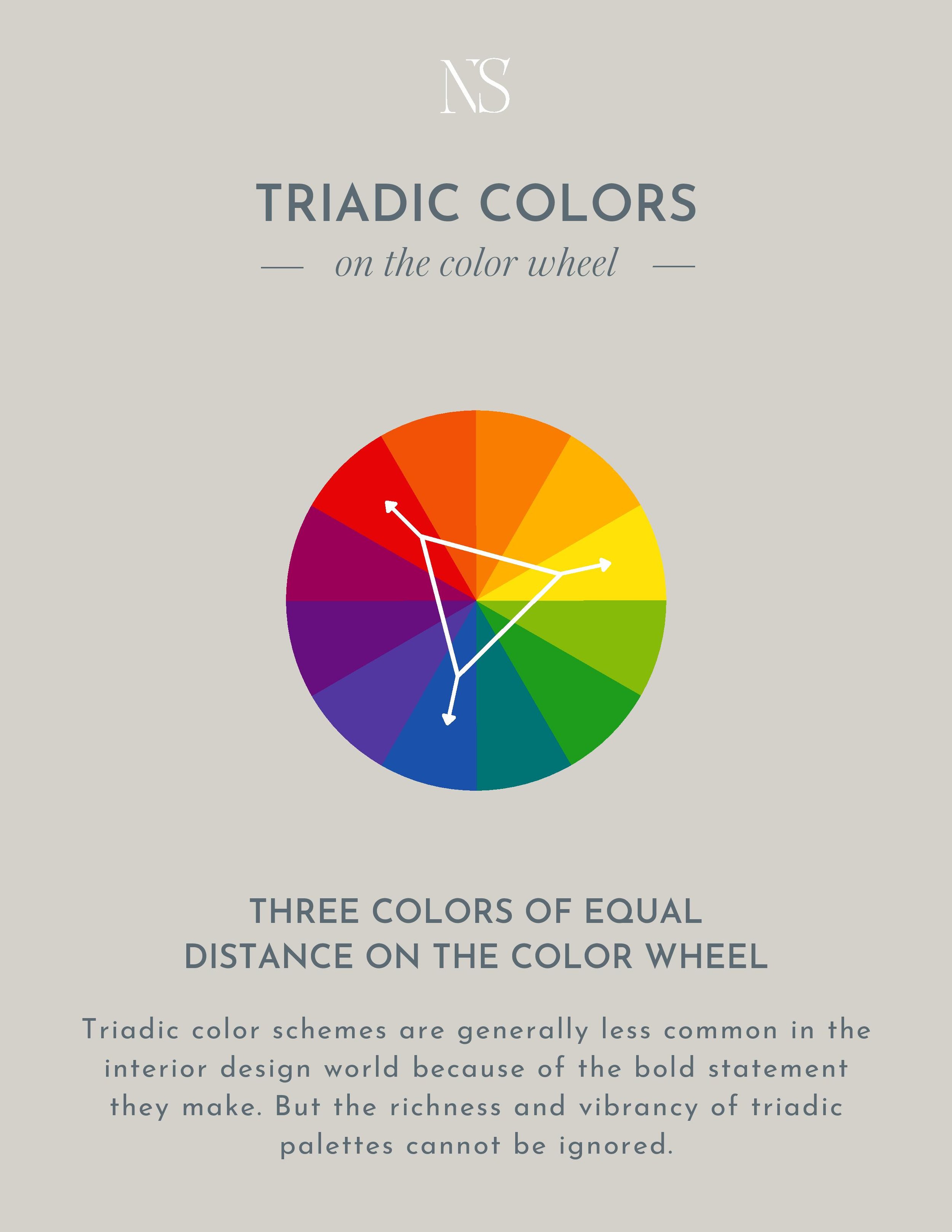
Why Designers Use Triadic Color Schemes
Designers like a triadic color scheme because it solves a common problem: how to make a design feel colorful without losing structure. It brings variety, but it also keeps the palette organized.
Here are some major benefits:
- Strong visual interest: The colors naturally create energy and movement.
- Better balance: Even spacing helps the palette feel stable.
- Flexible use: It works in branding, interior design, art, packaging, and digital products.
- Easy accent pairing: One color can lead, while the others support.
- Good for storytelling: A triadic color scheme can express personality, emotion, and action.
In my own work, triadic palettes have been especially useful when a client wanted something more vibrant than neutral but not as aggressive as a complementary scheme. That middle ground is often the sweet spot.
Common Types of Triadic Color Schemes
There is more than one way to build a triadic color scheme. The basic idea stays the same, but the feel changes based on which colors you pick.
Primary Triadic Color Scheme
This uses red, yellow, and blue. It feels classic, familiar, and bold. It is often associated with childhood, play, and traditional art systems.
Secondary Triadic Color Scheme
This uses orange, green, and purple. It feels a little more modern and expressive. It is a good choice when you want the palette to feel fun but less expected.
Tertiary Triadic Color Scheme
This uses three tertiary colors, such as red-orange, yellow-green, and blue-purple. This version often looks more refined and subtle because the colors are less saturated than the primary set.
Muted or Toned Triadic Color Scheme
This version uses softened hues, like dusty blue, muted coral, and olive green. It is often easier to use in real projects because it feels cleaner and less overwhelming.
How to Build a Triadic Color Scheme
Building a good triadic color scheme is more than picking three colors from the wheel. You need to control dominance, saturation, and contrast so the palette feels intentional.
Here is a simple process:
-
Pick your base color
Start with the color that fits the mood you want most. -
Find the two matching triad colors
Move evenly around the color wheel to locate the other two points. -
Adjust saturation
Soften bright colors if the palette feels too loud. -
Set one color as the lead
Let one color dominate and use the others as support. -
Add neutrals
White, gray, black, beige, or off-white can help the scheme breathe. -
Test it in context
A color scheme can look great on a wheel but different in a real layout.
I usually recommend starting with a dominant color ratio like 60, 30, 10. That means one color leads, one supports, and one acts as a small accent. It is a simple trick, but it keeps a triadic color scheme from becoming too busy.
Best Uses for a Triadic Color Scheme
A triadic color scheme works well in projects that need personality, contrast, and clarity. It is a strong choice when the goal is to catch attention without losing readability.
You will often see triadic palettes in:
- Branding for creative companies
- Children’s products
- Apps and websites with a lively tone
- Posters and event graphics
- Editorial illustrations
- Product packaging
- Interior spaces that need energy
One thing I have learned from experience is that not every brand should use a pure triadic color scheme at full strength. A financial app, for example, may need more restraint. But a music platform, design studio, or youth brand can benefit from the extra energy.
Triadic Color Scheme in Branding
In branding, a triadic color scheme can help a brand feel memorable and flexible. It gives a business more depth than a single-brand color and more personality than a plain neutral system.
The challenge is consistency. If all three colors shout at the same time, the brand can feel scattered. Strong brands usually make one color the hero and use the other two in specific places, like buttons, highlights, charts, or illustrations.
A good branding example is when a company uses one color for trust, one for energy, and one for optimism. The triadic color scheme becomes a visual language rather than just decoration.
Triadic Color Scheme in Web and UI Design
Web and UI design need color schemes that support usability first. A triadic color scheme can work well, but only if contrast and hierarchy stay clear.
For digital interfaces, use the palette like this:
- One color for primary actions
- One color for secondary actions
- One color for highlights or alerts
- Neutrals for backgrounds and text areas
Do not use all three colors at full saturation across large blocks of the interface. That is one of the fastest ways to make a triadic color scheme feel noisy. I have seen this mistake many times in early mockups, and the fix is usually simple: reduce saturation and give the colors room to breathe.
Triadic Color Scheme in Art and Illustration
Artists love a triadic color scheme because it gives them structure without limiting creativity. It is especially useful for paintings, digital art, comics, and character design.
The palette supports strong emotional contrast. For example, a triadic color scheme with orange, green, and purple can create a surreal, imaginative mood. If you lower the saturation, the same triad can feel nostalgic or cinematic.
Many illustrators use a triadic color scheme to guide the eye across the composition. One color pulls focus, another balances it, and the third adds rhythm. That visual rhythm can make a piece feel alive.
How to Keep a Triadic Color Scheme Balanced
Balance is the biggest secret behind a successful triadic color scheme. Without it, the design can feel like a color fight.
Use these tips:
- Choose one dominant color
- Keep one or two colors less saturated
- Use neutrals to create visual rest
- Repeat colors across the layout for cohesion
- Control the size of each color area
- Test the palette in natural light or on different screens
A useful analogy is to think of the triadic color scheme like a small band. One color is the lead singer, one is rhythm, and one is harmony. If everyone sings at full volume, the song loses shape.
Common Mistakes to Avoid
Even though a triadic color scheme is flexible, it can go wrong fast if you push it too hard.
Here are the most common mistakes:
- Using all three colors in equal amounts
- Choosing colors that are too bright together
- Ignoring contrast for text and accessibility
- Forgetting to add neutrals
- Picking colors that clash in temperature
- Using too many shades without a clear system
I once worked on a palette where the three triadic colors looked exciting in isolation but became overwhelming in a full layout. The fix was not to replace the colors. It was to calm the saturation and give each color a job. That lesson stuck with me: a triadic color scheme needs direction, not just energy.
Triadic Color Scheme vs Other Color Schemes
It helps to compare a triadic color scheme with other common schemes so you can see when it is the right choice.
Triadic vs Complementary
A complementary scheme uses two opposite colors. It creates stronger tension and a more dramatic feel. A triadic color scheme is softer in structure and usually offers more variety.
Triadic vs Analogous
An analogous scheme uses colors next to each other on the wheel. It feels smoother and more unified. A triadic color scheme adds more contrast and energy.
Triadic vs Monochromatic
A monochromatic scheme uses one hue with different shades and tints. It is the easiest to control. A triadic color scheme is richer and more dynamic, but harder to balance.
Practical Tips for Choosing a Triadic Color Scheme
If you want your triadic color scheme to look polished, keep things simple at first.
Try these practical tips:
- Start with mood first, not color first
- Make one color dominant
- Use muted versions for large areas
- Check contrast with text and icons
- Test the palette on real mockups
- Save your palette in HEX, RGB, and CMYK if needed
For print work, always check how the triadic color scheme behaves in CMYK, because colors often shift from screen to paper. That little step can save you from a costly surprise.
Real-Life Examples of Triadic Color Scheme Use
You can see a triadic color scheme in many places around you. Children’s brands often use it because it feels bright and friendly. Sports graphics use it because it creates motion and excitement.
A few everyday examples include:
- A logo using blue, orange, and green with blue as the main color
- A poster with purple type, green shapes, and orange accents
- A living room with teal, rust, and mustard, balanced by white walls
- A website using navy, coral, and lime as accent colors
In practice, the best triadic color scheme is rarely the one with the most intense colors. It is the one that feels most natural in context.
Frequently Asked Questions
What is the main idea behind a triadic color scheme?
A triadic color scheme uses three colors spaced evenly on the color wheel. This creates contrast while still keeping the palette balanced and easy to use.
Is a triadic color scheme good for beginners?
Yes, but it takes practice to balance the colors well. Beginners should start with one dominant color and use the other two as accents.
How do I make a triadic color scheme look less busy?
Use muted tones, add neutral space, and avoid equal color amounts. A strong hierarchy usually makes the whole palette feel calmer.
Can a triadic color scheme work in modern design?
Absolutely. It works very well when the colors are softened and paired with clean layouts. Many modern brands use triadic principles without making the palette look overly bright.
What colors are in a classic triadic color scheme?
The classic triadic set is red, yellow, and blue. However, any three colors evenly spaced on the wheel can form a triadic color scheme.
Conclusion
A triadic color scheme is a smart way to bring energy, balance, and variety into design. When used well, it can make a brand, website, artwork, or room feel alive without losing structure.
The key is not just choosing three colors. It is choosing how they work together, how much space they get, and which one leads the story. If you want stronger visual results, start with one dominant color, soften the others, and test the palette in real use.
Try building your own triadic color scheme today, then see how it changes the mood of your project. If you want, explore more color theory guides and leave a comment with the palette you are working on.