
Color psychology in art explains how colors shape mood, meaning, and emotional response in visual works.
Color psychology in art is one of those topics that feels simple at first, then opens into something much deeper. In my experience, once you understand how color works, you stop “decorating” artwork and start guiding how people feel when they see it. That is what makes color psychology in art such a powerful tool for painters, illustrators, designers, and anyone who wants their work to communicate with intention.
What Color Psychology in Art Really Means
Color psychology in art is the study of how colors influence human emotion, attention, and interpretation in visual art. It looks at both the universal and cultural meanings of color, as well as the personal memories people attach to color.
In plain terms, color can make a painting feel calm, tense, hopeful, lonely, playful, or sacred. A single shift in hue, saturation, or brightness can change the whole message of a piece. That is why artists use color not only to make work look appealing, but also to shape meaning.
A few things matter most in color psychology in art:
- Hue, which is the color itself, like red or blue
- Saturation, which is how intense or muted the color feels
- Value, which is how light or dark the color is
- Contrast, which affects focus and emotional tension
- Context, because the same color can feel different depending on the other colors around it
I have seen this again and again in creative work. A warm gold can feel luxurious in one composition and spiritual in another. A deep blue can feel peaceful in one painting and sad in another. Color psychology in art is never just one fixed meaning.

Why Color Psychology in Art Matters
Color psychology in art matters because people often react to color before they understand form or subject. In the first few seconds, color helps set the emotional tone of a piece. That first reaction can influence whether someone feels drawn in, unsettled, comforted, or curious.
Artists and visual communicators use this on purpose. Museums, galleries, branding teams, illustrators, and digital creators all rely on color to guide the eye and shape interpretation. Even if viewers do not know the theory behind it, they still feel its effect.
Here is why it matters in practice:
- It strengthens emotional storytelling
- It helps direct attention to the focal point
- It supports the theme or concept of the artwork
- It can make art feel more memorable
- It helps artists communicate more clearly across language barriers
A mistake I made early on was choosing colors I personally liked without asking what the piece needed to say. The work looked nice, but it felt emotionally flat. Once I started matching color choices to the idea behind the piece, the work gained more life and purpose.
The Emotional Meaning of Common Colors
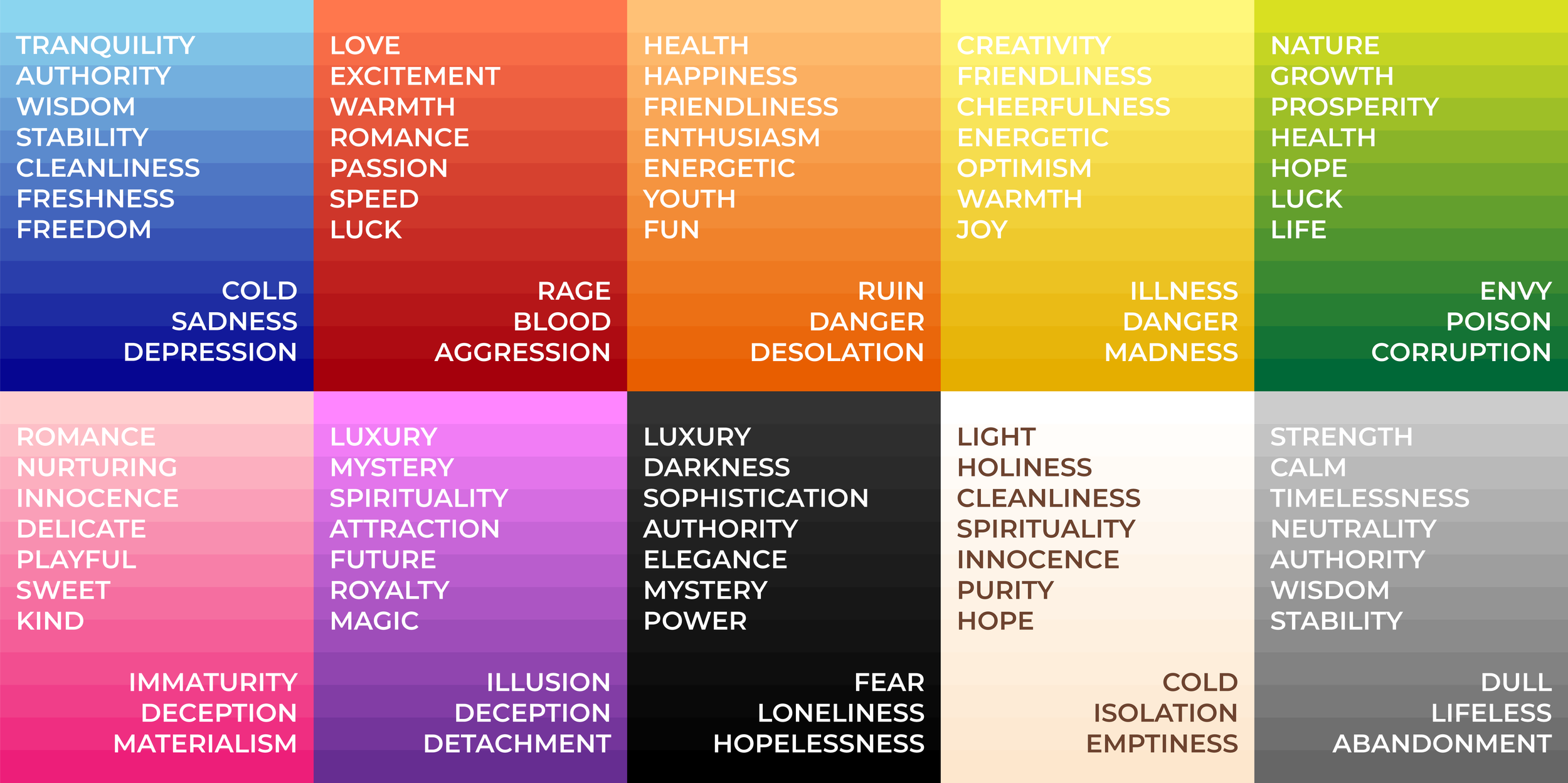
Color psychology in art often begins with a basic understanding of common color associations. These associations are not rules, but they are useful patterns that many viewers recognize.
Red
Red often signals energy, passion, danger, power, or urgency. In art, it can create excitement or tension very quickly.
Used well, red can make a composition feel alive. Used too heavily, it can overwhelm the viewer and dominate the entire piece.
Blue
Blue is often linked to calm, trust, reflection, sadness, or distance. It is one of the most flexible colors in art because it can feel soothing or emotional depending on the shade.
Light blue may feel airy and peaceful, while dark blue can feel serious or deep. In color psychology in art, blue often helps create space for thought.
Yellow
Yellow is often tied to warmth, optimism, joy, and light. It can bring a cheerful energy to a piece and make a scene feel bright and open.
At the same time, strong yellow can also feel harsh or unstable in large amounts. Balance matters a lot here.
Green
Green is commonly associated with nature, growth, balance, healing, and renewal. It often creates a grounded, restful feeling.
In art, green can also feel eerie or artificial if the tone is unusual. That contrast makes it especially useful in emotional storytelling.
Black
Black can suggest mystery, grief, elegance, authority, or finality. It adds weight and drama to a composition.
Many artists use black to sharpen contrast and create a sense of depth. In color psychology in art, black is powerful because it can feel both refined and unsettling.
White
White often suggests purity, simplicity, peace, or emptiness. It can make a composition feel open and clean.
But white can also feel cold, distant, or sterile if overused. It depends on the surrounding colors and the mood of the piece.
Purple
Purple is often linked to mystery, spirituality, imagination, and luxury. It can feel rich and symbolic.
In my own work, purple has often helped create a dreamlike mood. It works especially well when you want a piece to feel less literal and more emotional.
Orange
Orange usually feels warm, active, friendly, and energetic. It sits between the intensity of red and the joy of yellow.
It is great for movement and enthusiasm, but it can become loud if it is not controlled. Small amounts often have more impact than large blocks.

How Artists Use Color to Shape Mood
Color psychology in art is not only about isolated color meanings. It is about how artists combine colors to create mood.
Mood comes from the whole palette, not just one color. A soft pastel blue may feel peaceful, but the same blue beside harsh black and bright red can feel tense or uneasy.
Artists shape mood through:
- Warm colors for energy, intimacy, or movement
- Cool colors for calm, distance, or reflection
- High contrast for drama and intensity
- Low contrast for softness and quiet
- Saturated colors for bold emotion
- Muted colors for subtlety and restraint
I often think of color like music. One note does not make a song. The emotional result comes from the full arrangement. That is why color psychology in art works best when every color choice supports the same emotional direction.
Cultural Differences in Color Psychology in Art
Color psychology in art is not universal in every detail. Culture, religion, history, and personal experience can all change how people interpret color.
For example, white may symbolize purity in some cultures, while in others it can be linked to mourning. Red may feel celebratory in one context and alarming in another. Because of this, artists should avoid assuming that one color has the exact same meaning for everyone.
This is where trustworthiness matters. A good artist does not overclaim. Instead, they understand that color psychology in art gives likely emotional patterns, not fixed laws.
Things that influence cultural color meaning include:
- Religion and tradition
- National symbols
- Social customs
- Historical events
- Media and pop culture
If you are creating art for a global audience, it helps to research the cultural context. That small step can prevent misreading and make your work more thoughtful.
The Science Behind Color Psychology in Art
There is real research behind color psychology, though the findings are sometimes nuanced. Studies in psychology and design suggest that color can affect attention, perception, and emotional response. However, results often depend on context, personal history, and the task at hand.
In other words, color does affect us, but not in a simple one-color-one-emotion way. The brain processes visual cues quickly, and color often helps set expectations before we even consciously analyze the artwork.
Useful scientific ideas in color psychology in art include:
- Bright colors can increase arousal and attention
- Muted colors can lower visual intensity and calm the scene
- Contrast helps the eye find focal points
- Color associations can be learned over time
- Emotional response can shift based on mood, memory, and setting
This is why some color advice online feels too absolute. The truth is more layered. Good art uses both broad psychological patterns and the artist’s own intuition.
Practical Ways to Use Color Psychology in Art
If you want to use color psychology in art more intentionally, start with the feeling you want the viewer to have. Then build your palette around that goal.
1. Start with the emotion
Ask yourself what the piece should feel like.
- Calm
- Tense
- Romantic
- Lonely
- Hopeful
- Playful
- Sacred
Once the emotion is clear, color choices become easier.
2. Build a limited palette
A limited palette keeps the message focused. Too many colors can blur the emotional tone.
For example:
- Blue and gray can support quiet reflection
- Red and black can create drama
- Soft pink, cream, and peach can feel tender
- Green and brown can feel natural and grounded
3. Use contrast with care
Contrast creates emphasis, but too much can create chaos. If everything is bright, nothing stands out.
A strong focal point often comes from one color that breaks the pattern.
4. Test color on small studies
I strongly recommend making quick color sketches before finishing a piece. Small studies help you see what the palette actually feels like in practice.
This is one of the best habits I have learned. It saves time and prevents a lot of guesswork.
5. Pay attention to light and surface
The same color can look different on canvas, paper, digital screens, or textured surfaces. Light changes everything.
That means color psychology in art is also affected by medium, finish, and viewing environment.
Color Psychology in Different Art Forms
Color psychology in art appears in many creative fields, and each one uses color a little differently.
Painting
Painters often use color to shape atmosphere, depth, and narrative. The emotional impact may come from brushwork, layering, and glazing as much as from hue itself.
Illustration
Illustrators use color to guide story and character mood. Color can quickly tell a viewer who feels safe, who feels powerful, or what kind of world they are entering.
Digital Art
In digital work, color choices can be tuned very precisely. Artists can test many palettes fast, which makes it easier to explore emotional effects.
Graphic Design
Designers use color psychology in art and design to build brand tone and user response. Color here has a practical role as well as an emotional one.
Photography and Mixed Media
Even when color is captured rather than painted, it still shapes meaning. Editing, filters, and material choice can all reinforce the emotional message.
Common Mistakes to Avoid
Color psychology in art can be powerful, but there are a few traps that many artists fall into.
- Using colors only because they are trendy
- Choosing too many bright colors at once
- Relying on color stereotypes without context
- Ignoring cultural meaning
- Forgetting that value and contrast matter as much as hue
- Making every color equally strong
- Overthinking the theory and losing the feeling
One of my biggest early mistakes was treating color theory like a formula. I thought the “right” palette would always produce the “right” emotion. Real practice taught me that color psychology in art works best when technical knowledge and instinct support each other.
Benefits of Understanding Color Psychology in Art
Learning color psychology in art gives you more control over how your work communicates. It also helps you make choices faster and with more confidence.
Some key benefits include:
- Stronger emotional storytelling
- Better composition and focal control
- More intentional style development
- Improved communication with viewers
- Greater consistency across a series of artworks
- Better alignment between theme and visual tone
For viewers, it can also deepen appreciation. Once people notice how color guides feeling, they start seeing artwork in a richer way.
Limitations of Color Psychology in Art
It is important to be honest about the limits of color psychology in art. Color is influential, but it does not work in isolation.
Limitations include:
- Personal memory can override general meaning
- Cultural context can change interpretation
- The same color can feel different in different combinations
- Lighting and display conditions can alter perception
- Viewers may respond in unexpected ways
This does not make color psychology in art less useful. It just means artists should treat it as a guide, not a rulebook.
Frequently Asked Questions of color psychology in art
What is color psychology in art?
Color psychology in art is the study of how colors affect emotion, mood, and interpretation in visual work. Artists use it to help shape how viewers respond to a piece.
Why is color psychology important for artists?
It helps artists communicate feeling more clearly. A thoughtful palette can make artwork more memorable, emotional, and meaningful.
Is color psychology in art the same for everyone?
No, not exactly. General patterns exist, but personal experience and culture can change how someone reads a color.
How can I use color psychology in my own artwork?
Start with the emotion you want to express, then choose colors that support that feeling. Small studies and palette testing can help you see what works best.
Can one color always mean the same thing in art?
No, one color can mean many things depending on context. For example, red can feel warm, dangerous, romantic, or powerful depending on how it is used.
Does color psychology work in digital art too?
Yes, absolutely. Digital art often gives even more control over saturation, contrast, and palette testing, so color psychology can be very effective there.
Conclusion
Color psychology in art is about more than pretty palettes. It is a practical way to shape mood, guide attention, and tell a deeper story through visual choices. When you understand how color works, you give your art more voice, more feeling, and more staying power.
The best results come from balancing knowledge with instinct. Start noticing how color changes the meaning of your work, test new palettes, and pay attention to how people respond. If this topic sparked ideas for you, explore more color studies, try a new palette in your next piece, or share your thoughts in the comments.