
Color schemes for beginners usually start with one base color, one support color, and one accent color.
If you are learning color schemes for beginners, you are already asking the right question. Good color choices can make a room feel calm, a brand feel trustworthy, or a design feel polished, even if the layout is simple. I have seen many new designers overcomplicate color at first, but once you understand a few core rules, it becomes much easier to create work that looks clean, balanced, and intentional.
What a color scheme is and why it matters
A color scheme is the planned way colors work together in a design. It is not just about picking pretty colors. It is about creating harmony, contrast, and mood.
For color schemes for beginners, this matters because color affects how people feel and how they notice important details. A strong scheme can guide the eye, improve readability, and make a brand or space feel more complete. In design work I have reviewed, color was often the difference between “nice idea” and “finished project.”
Common goals of a color scheme include:
- Creating balance so the design does not feel random
- Making key elements stand out
- Supporting a clear mood or style
- Helping users read and understand content faster
- Building visual consistency across pages, rooms, or products

The basic types of color schemes for beginners should know
If you are just starting, you do not need to learn every advanced theory right away. Focus on the core types of color schemes for beginners first. These are the ones used most often in design, branding, decorating, and digital content.
Monochromatic color scheme
A monochromatic color scheme uses one color in different shades, tints, and tones. For example, you might use light blue, medium blue, and dark blue together.
This is one of the easiest color schemes for beginners because it is hard to make it look messy. It creates a calm, smooth look. The risk is that it can feel flat if you do not add texture or contrast.
Analogous color scheme
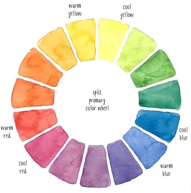
An analogous color scheme uses colors that sit next to each other on the color wheel. Think blue, blue-green, and green.
This scheme feels natural and pleasant. It works well when you want a soft transition between colors. In my experience, it is a great option for beginners who want color without a lot of tension.
Complementary color scheme
A complementary color scheme uses colors opposite each other on the color wheel, like blue and orange or red and green.
This creates strong contrast and energy. It is useful for calls to action, logos, and focal points. The challenge is balance. Too much contrast can feel loud, so beginners should use one color as the main base and the other as an accent.
Split-complementary color scheme
A split-complementary scheme uses one base color and the two colors beside its opposite on the color wheel. For example, instead of blue and orange, you might use blue with yellow-orange and red-orange.
This is a smart choice for color schemes for beginners because it gives you contrast without the harshness of a full complementary pair. It is often easier to control.
Triadic color scheme
A triadic scheme uses three colors spaced evenly around the color wheel. A common example is red, yellow, and blue.
This scheme is lively and balanced when used well. It can be fun, but beginners need to keep one color dominant. If all three colors fight for attention, the design can feel chaotic.
Neutral color scheme
A neutral scheme relies on colors like white, gray, beige, black, and soft brown.
This is not boring when done well. Neutral schemes are timeless and flexible, and they often pair beautifully with one accent color. Many professional designers use neutrals as a base because they make everything else easier to control.
How to choose the right color scheme as a beginner
Choosing from all the color schemes for beginners can feel overwhelming at first. The trick is to start with your purpose, not with your favorite color.
Ask yourself:
- What mood do I want?
- Where will the colors be used?
- Who is the audience?
- Do I need strong contrast or a soft look?
- Will this design be used on a screen or in print?
If you want a calm and simple result, start with monochromatic or analogous colors. If you want energy and impact, try complementary or split-complementary colors. If you are unsure, a neutral base with one accent color is usually the safest starting point.
A helpful rule I often use is this: choose one dominant color, one supporting color, and one accent color. That keeps the palette focused and easier to manage.
Color wheel basics beginners should understand
The color wheel is one of the best tools for learning color schemes for beginners. It helps you see how colors relate to each other.
The wheel usually includes:
- Primary colors: red, blue, yellow
- Secondary colors: green, orange, purple
- Tertiary colors: colors made by mixing primary and secondary colors
Here is why the color wheel matters. It shows you which colors are related, which colors contrast, and which ones create a certain mood. It is like a map for color decisions.
A simple way to remember it:
- Colors next to each other create harmony
- Colors opposite each other create contrast
- Colors spaced evenly create variety and balance
The role of shade, tint, tone, and saturation
Many beginners think color schemes for beginners are only about choosing hue, but that is only part of the picture. Shade, tint, tone, and saturation change how colors behave.
Shade
A shade is made by adding black to a color. It makes the color darker.
Tint
A tint is made by adding white to a color. It makes the color lighter.
Tone
A tone is made by adding gray. It softens the color.
Saturation
Saturation describes how strong or vivid a color looks. High saturation feels bold. Low saturation feels muted.
These adjustments matter because the same color can feel very different in a real design. A bright red may feel aggressive, while a muted red may feel elegant and warm.
Practical color rules that make beginner palettes look better
When I first started working with color schemes for beginners, one of my biggest mistakes was using too many colors at once. The result always looked busy. Over time, I learned that simple rules often create stronger designs.
Use these practical rules:
- Follow the 60 30 10 rule: 60% dominant color, 30% secondary color, 10% accent color
- Keep contrast strong enough for readability
- Use neutrals to give the eye a break
- Limit your palette to 3 to 5 colors
- Test colors in real light or on real screens before finalizing
- Make sure text is easy to read against backgrounds
This kind of structure helps beginners avoid guesswork. It also makes the design feel more intentional.
Common mistakes beginners make with color schemes
Even good color schemes for beginners can go wrong if a few basic mistakes happen. I have seen these many times in branding drafts, web mockups, and room makeovers.
Common mistakes include:
- Using too many colors
- Choosing colors only because they look nice individually
- Ignoring contrast and readability
- Picking shades that are too similar
- Forgetting about lighting, screen settings, or print differences
- Overusing bright colors
- Not testing the palette in context
One mistake that comes up often is trusting color swatches too much. A color can look great in a small sample but feel completely different once it covers a full wall or a full webpage.
How color schemes affect mood and communication
Color is emotional. It sends a message before words do. That is why color schemes for beginners should always connect to the feeling you want to create.
Here are some common associations:
- Blue often feels calm, stable, and trustworthy
- Red often feels bold, urgent, or energetic
- Green often feels fresh, natural, or balanced
- Yellow often feels bright, cheerful, and active
- Black often feels elegant, strong, or dramatic
- White often feels clean, open, and simple
These meanings are not universal, though. Culture, context, and industry change how people read color. For example, a soft green may feel relaxing in a wellness brand, while the same color might look dull in a sports logo.
Color schemes for beginners in real life
The best way to learn color schemes for beginners is to use them in real situations. Theory helps, but practice makes it stick.
In home decor
A neutral base with one or two accent colors works well in most rooms. For example, warm white walls, beige furniture, and deep green pillows can feel cozy and stylish.
In graphic design
A simple palette helps logos, flyers, and social graphics look professional. Many successful designs use one primary color, one secondary color, and a bright accent for buttons or highlights.
In web design
Websites need clear contrast and easy reading. A good palette supports navigation, separates sections, and makes calls to action easy to notice.
In fashion and personal style
Color schemes can help outfits feel coordinated. A monochromatic outfit, for example, can look polished without being loud.
Tools beginners can use to build better color palettes
You do not need advanced training to create good color schemes for beginners. A few simple tools can help a lot.
Useful tools and methods include:
- Color wheel apps
- Palette generators
- Mood boards
- Swatch books
- Accessibility checkers
- Screenshot testing on different screens
If you are working digitally, test your palette on mobile and desktop. If you are decorating a space, check colors during morning light and evening light. That small step can save a lot of regret later.
Tips to make color schemes feel professional
Professional-looking color schemes for beginners usually share the same traits: balance, consistency, and purpose.
Try these tips:
- Pick a clear main color
- Repeat colors in small ways across the design
- Use texture to support simple palettes
- Keep the background calm if the accent is bold
- Use color to organize information
- Check accessibility for text and buttons
- Stay consistent across every part of the project
A polished palette is like a good conversation. Nothing shouts, but everything feels connected.
When to break the rules
Learning color schemes for beginners also means knowing when to bend the rules. Not every project needs a textbook palette.
You might break the rules when:
- You want a bold artistic effect
- The brand identity calls for something unusual
- You are creating a seasonal or event-based design
- You need a strong emotional impact
Still, breaking the rules works best when you already understand them. Otherwise, it can look accidental instead of creative.
Frequently Asked Questions
What is the easiest color scheme for beginners?
A monochromatic or neutral color scheme is usually the easiest to start with. These schemes are simple to control and often look clean even without much experience.
How many colors should a beginner use?
Most beginners should start with 3 to 5 colors. That range is enough to create variety without making the design feel crowded.
What is the safest color scheme for a professional look?
A neutral base with one accent color is a very safe choice. It works well in branding, interiors, and web design because it feels clean and easy to read.
Why does my color scheme look messy?
It usually looks messy because the colors do not have a clear role. Too many strong colors or weak contrast can make everything compete for attention.
How do I know if my colors go together?
Use the color wheel as a guide and test your palette in context. If the colors support the mood you want and remain easy to read, they are probably working well together.
Conclusion
Learning color schemes for beginners does not have to be intimidating. Once you understand the basic types, the role of contrast, and the importance of balance, color becomes much easier to use with confidence.
Start small, test your choices, and focus on clarity before style. The best palettes are not always the loudest ones; they are the ones that support the message and feel natural to the eye. Try building one simple palette today, and keep refining it as you learn more.