
Muted color palettes use softened, desaturated tones to create calm, balanced, and timeless visuals.
Muted color palettes have become a quiet favorite in design, branding, interiors, and fashion because they feel refined without shouting for attention. They sit between bright color and neutral gray, which gives them a gentle, polished look that works in modern spaces and across digital screens. If you want a palette that feels elegant, flexible, and easy to live with, understanding muted color palettes is a smart place to start.

What Are Muted Color Palettes?
Muted color palettes are color schemes built from tones that have been softened with gray, black, white, or their complementary colors. Instead of strong saturation, the colors feel calmer and less intense. Think dusty blue, sage green, clay pink, warm taupe, soft terracotta, and smoky lavender.
In simple terms, muted color palettes are not dull. They are restrained. That restraint is what gives them depth and makes them so useful in visual design. I often describe them to clients as the “whisper” version of color.
A muted palette usually includes:
- Soft neutrals such as ivory, stone, beige, and charcoal
- Desaturated accent colors like sage, slate blue, mauve, and ochre
- Balanced contrast so the palette feels smooth, not flat
This is one reason muted color palettes show up so often in modern branding, editorial design, home decor, and UX design. They are easy on the eye and feel emotionally steady.
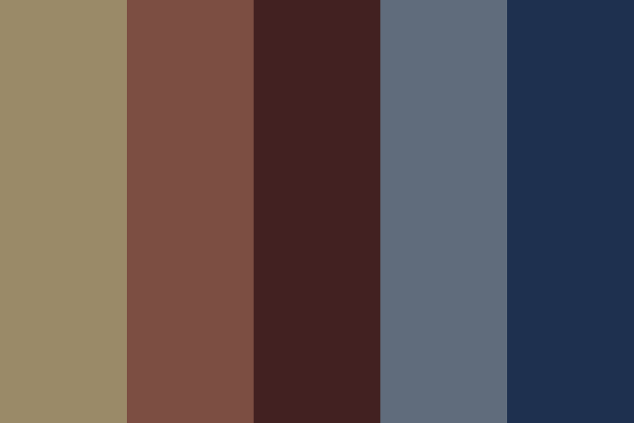
Why Muted Color Palettes Work So Well
Muted color palettes work because the human eye tends to relax around low-saturation colors. Bright colors can grab attention fast, but muted tones hold attention longer because they feel stable and comfortable. In design psychology, that can translate into trust, warmth, and sophistication.
From my own work, I’ve noticed that muted color palettes are often the safest choice when the goal is to make a brand feel premium without looking cold. A wellness brand I worked with once tested bold greens against muted sage tones. The muted version won because it felt more grounded and less salesy.
Here’s why these palettes are so effective:
- They reduce visual noise and help content feel organized
- They create a calm mood, which supports comfort and trust
- They pair well with both modern and classic styles
- They work across print, web, photography, and interiors
- They age better than trend-heavy neon or highly saturated palettes
Research in color perception has long shown that color can influence emotion and attention. While reactions vary by culture and context, softer tones are generally linked with calmness and subtle elegance. That makes muted color palettes especially useful when a brand or space needs to feel approachable.
Key Characteristics of Muted Color Palettes
Muted color palettes share a few clear traits, and learning them helps you spot them instantly.
Lower saturation
The color has less intensity. A muted red may feel like brick, rosewood, or rust instead of pure cherry red.
Balanced contrast
Muted palettes often avoid harsh jumps between light and dark. The result feels smoother and more unified.
Natural undertones
Many muted color palettes borrow from nature. You’ll see stone, clay, moss, sand, mist, and wood tones.
Soft emotion
These colors often feel thoughtful, mature, and calm. They do not demand attention. They invite it.
Flexible pairing
Muted tones work well with other muted tones, but they also pair nicely with clean whites, deep navy, or black for contrast.
Common Types of Muted Color Palettes
Muted color palettes come in many styles, depending on the mood you want to create. Each version has its own personality.
Warm muted palettes
These use colors like terracotta, beige, oatmeal, dusty peach, and olive. They feel cozy, human, and inviting.
Best for:
- Lifestyle brands
- Cafes and hospitality
- Home decor
- Seasonal marketing
Cool muted palettes
These use slate blue, mist gray, soft teal, lavender, and cool stone. They feel clean, thoughtful, and peaceful.
Best for:
- Tech brands
- Healthcare
- Minimalist websites
- Editorial layouts
Earthy muted palettes
These include moss, clay, sand, rust, and bark brown. They feel organic and timeless.
Best for:
- Sustainable brands
- Skincare
- Outdoor products
- Interior design
Romantic muted palettes
These lean into blush, mauve, dusty rose, and soft plum. They feel gentle and elegant without being overly sweet.
Best for:
- Weddings
- Fashion
- Beauty brands
- Lifestyle photography
Monochrome muted palettes
These use one color family in several soft shades. A palette of mist blue, slate blue, and navy gray can feel very polished.
Best for:
- Corporate branding
- UX/UI systems
- Clean visual identities

Where Muted Color Palettes Are Used
Muted color palettes are popular because they adapt to many industries and design goals.
Branding
Brands use muted color palettes to look premium, mature, and trustworthy. They are especially effective for products that want to signal quality instead of hype.
Interior design
Muted tones help rooms feel bigger, calmer, and more cohesive. They are common in Scandinavian, Japandi, and modern rustic spaces.
Fashion
Muted color palettes in clothing often create a refined look that works across seasons. They also make outfits easier to mix and match.
Web and UI design
Muted colors improve readability when used correctly. They can support clean interfaces and make content feel less tiring on the eyes.
Photography and film
Muted grading is often used to create a nostalgic, cinematic, or documentary feel. It can make images feel more intimate and less polished in a harsh way.
Packaging
Muted packaging often signals natural, handmade, or upscale products. It helps the product stand out through restraint rather than loud color.
How to Build a Muted Color Palette
Creating a good muted color palette is part science and part instinct. You want harmony, but you also need enough contrast so the design does not feel washed out.
Here is a practical process I’ve used many times:
-
Choose a base mood
Decide whether you want calm, earthy, romantic, clean, or editorial. -
Pick one anchor color
Start with one muted color you love, such as sage, dusty blue, or clay. -
Add neutrals
Bring in cream, warm gray, taupe, charcoal, or off-white to support the palette. -
Create contrast
Add one darker shade for structure and one lighter shade for breathing room. -
Test in real use
Check the palette on a screen, on paper, or in a room, not just in a color tool.
A mistake I see often is making every color equally soft. That can make the palette feel sleepy. One strong anchor, one dark grounding tone, and one light neutral usually make the whole system work better.
Best Color Combinations for Muted Color Palettes
Some muted combinations feel especially balanced because they reflect natural pairings.
- Sage green and warm beige
- Dusty blue and soft gray
- Clay pink and ivory
- Olive and charcoal
- Mauve and stone
- Terracotta and cream
- Smoky teal and sand
These combinations work because they stay gentle while still giving the eye enough difference to follow. In design, that difference matters more than people think. If all the colors have the same softness, the result can feel flat.
A good rule is to mix:
- One main muted color
- One supporting muted color
- One neutral
- One deeper shade for contrast
Benefits of Using Muted Color Palettes
Muted color palettes offer both visual and practical benefits.
They feel timeless
Muted palettes do not rely on fast-moving trends as much as bright, trendy colors do. That makes them a smart long-term choice.
They support readability
When used well, they reduce glare and make layouts easier to process. This is especially helpful on screens and in printed materials.
They feel premium
Many luxury and boutique brands use muted palettes because they suggest refinement and confidence.
They are versatile
Muted color palettes can work in rustic, modern, classic, and minimalist designs. That flexibility saves time and keeps branding consistent.
They are emotionally calming
Soft colors can make a space, product, or interface feel less aggressive. That can improve the overall user experience.
Limitations of Muted Color Palettes
Muted color palettes are not perfect for every situation. They can fall short if you need strong urgency, bold energy, or fast attention.
Common limitations include:
- They can look bland if contrast is too low
- They may feel too safe for youth-focused or playful brands
- They can lose impact if used without a strong visual hierarchy
- Some muted shades may look muddy on low-quality screens or cheap print
- They may not suit brands that need loud, high-energy messaging
I learned this the hard way with a campaign that used soft beige on light gray. It looked elegant in theory, but the call-to-action got lost. The fix was simple: we deepened the button color and increased contrast. The palette stayed muted, but the message became clear.
How to Use Muted Color Palettes Without Making Them Boring
This is where many people get stuck. A muted color palette can absolutely feel rich, but it needs texture and structure.
Try these tips:
- Add contrast with dark text or accents
- Use different materials, patterns, or textures
- Mix warm and cool tones carefully
- Use white space to let colors breathe
- Add one small unexpected accent color if needed
For example, a muted palette of cream, sage, and clay can feel much more alive when paired with black typography, linen texture, and a tiny accent of copper. It is like seasoning food. Too little and it tastes flat. Just enough and everything comes alive.
Muted Color Palettes in Branding and Marketing
In branding, muted color palettes often help a business feel more human and less pushy. That matters a lot in markets where trust is the main currency.
They are especially useful for:
- Skincare and beauty
- Wellness and mindfulness
- Sustainable products
- Interior and lifestyle brands
- High-end services
Muted branding works well because it suggests calm confidence. It says, “We do not need to shout.” That can be powerful when your audience is tired of aggressive ads and overdesigned visuals.
To make muted branding stronger:
- Pair the palette with clean typography
- Use consistent image treatment
- Keep the logo simple
- Maintain contrast for accessibility
- Choose one signature shade that is easy to recognize
Muted Color Palettes in Interior Design
Muted color palettes are a favorite in interiors because they make spaces feel restful. They also allow furniture, art, and natural light to do more of the work.
Popular muted interior colors include:
- Warm white
- Greige
- Dusty blue
- Sage green
- Soft terracotta
- Mushroom gray
These shades work well in bedrooms, living rooms, and kitchens because they create a sense of calm. They also age well, which matters if you do not want to repaint every season.
A helpful interior design tip is to vary finish and texture. A muted wall color can feel far more interesting when combined with wood grain, woven fabrics, matte ceramics, and brushed metal.
Accessibility and Readability Tips
Muted color palettes can be beautiful, but accessibility should always come first. A soft palette is not useful if people cannot read it.
Keep these rules in mind:
- Make sure text has enough contrast against the background
- Avoid pale text on pale backgrounds
- Test colors on phones, tablets, and different screens
- Use tools that check contrast ratios
- Do not rely on color alone to communicate meaning
The Web Content Accessibility Guidelines recommend strong enough contrast for text and interface elements. That is especially important for muted palettes, since soft colors can easily drift into low-contrast territory.
Real-World Examples of Muted Color Palettes
Muted color palettes show up everywhere once you start looking.
- A skincare brand may use sage, cream, and taupe to feel pure and calm
- A coffee shop may use terracotta, warm gray, and charcoal to feel cozy and modern
- A portfolio website may use dusty blue, ivory, and slate to look elegant and professional
- A bedroom may use mushroom, beige, and olive for a restful mood
These examples work because the palette supports the message. The color is not there just to decorate. It is there to shape how the viewer feels.

Frequently Asked Questions About Muted Color Palettes
What makes a color palette muted?
A color palette becomes muted when its colors are softened with gray, black, white, or complementary tones. This lowers saturation and makes the colors feel calmer and less intense.
Are muted color palettes good for branding?
Yes, muted color palettes are often excellent for branding because they can make a business feel refined, trustworthy, and timeless. They work especially well for wellness, beauty, lifestyle, and premium products.
Do muted color palettes work in small rooms?
Yes, they can work very well in small rooms because soft tones often make spaces feel open and calm. Just make sure there is enough contrast so the room does not feel washed out.
How do I keep a muted palette from looking boring?
Use contrast, texture, and a strong visual hierarchy. A muted color palette becomes more interesting when you mix light and dark tones and add materials like wood, linen, metal, or paper grain.
Are muted color palettes always neutral?
No, muted color palettes can include color. The key is reduced saturation, not the absence of color, so shades like dusty rose, sage green, and smoky blue still count.
Conclusion
Muted color palettes are powerful because they do so much with so little. They bring calm, clarity, and style to branding, interiors, fashion, and digital design without feeling loud or trendy. When you choose them with care and balance them with contrast, they can make your work feel more polished, more human, and more lasting.
If you are planning a design project, try building a muted color palette with one anchor shade, a few soft companions, and one darker tone for structure. Start small, test often, and trust your eye. If this guide helped, explore more design resources, subscribe for future tips, or leave a comment with your favorite muted color combination.