
A neutral color palette uses understated hues like white, beige, gray, taupe, and black to create balance.
A well-made neutral color palette can do a lot of heavy lifting in design. It can make a room feel calm, help a brand look refined, or give an outfit a clean, timeless look. I’ve used a neutral color palette in everything from interiors to web layouts, and the biggest lesson is simple: when the tones are right, the whole space feels easier to live with, work in, and enjoy.
What Is a Neutral Color Palette?
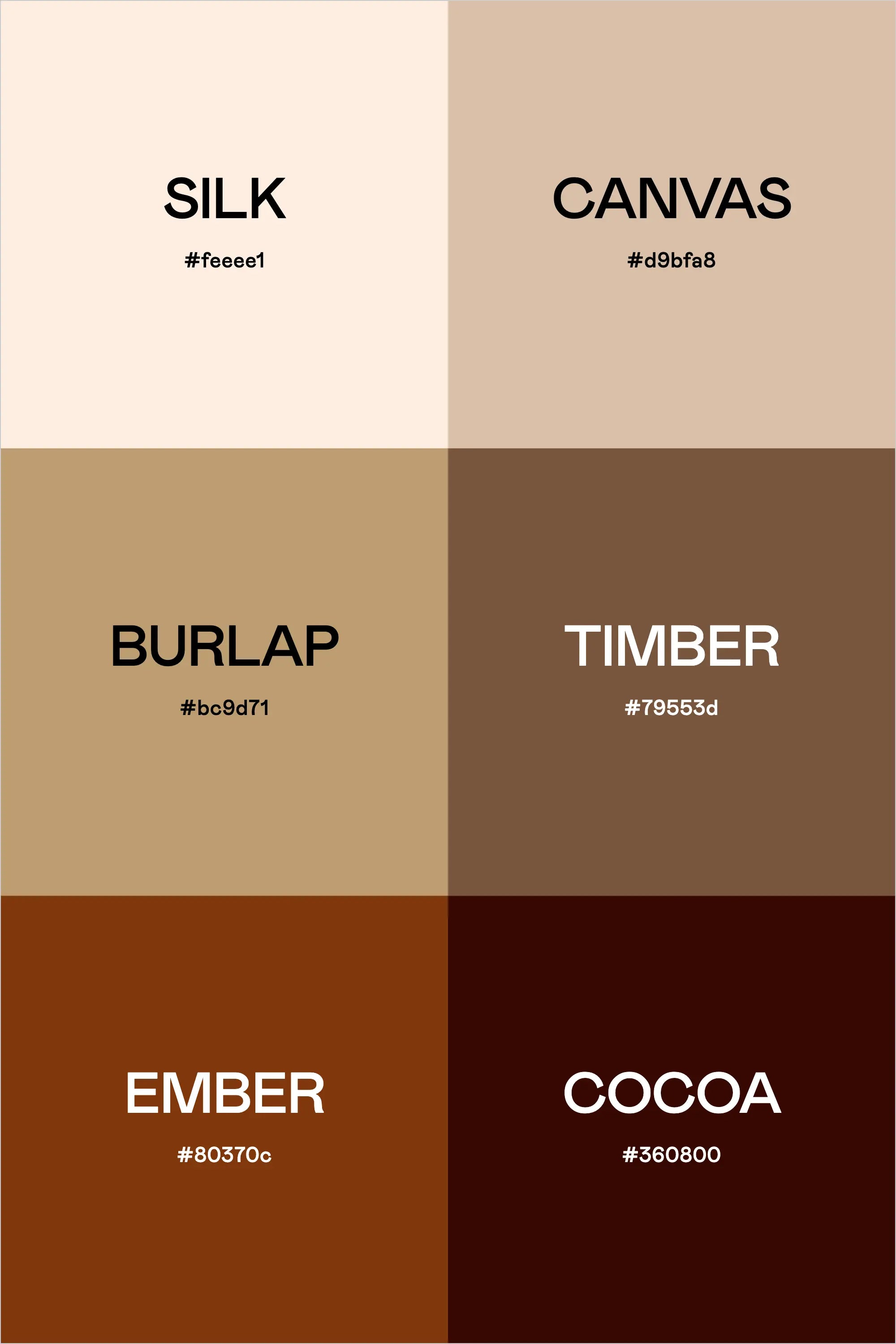
A neutral color palette is a group of colors that stay soft, balanced, and low in visual noise. These shades usually include white, ivory, cream, beige, taupe, gray, brown, black, and muted earth tones. Unlike bright colors, a neutral color palette does not demand attention right away. Instead, it supports the rest of the design and lets textures, shapes, and light do more of the talking.
In design work, neutral color palettes are often used because they are flexible and easy to build around. They can feel warm or cool, modern or classic, minimal or cozy. That versatility is one reason the neutral color palette remains so popular in interior design, fashion, branding, and digital design.
A neutral color palette is not boring when it is done well. It is more like a quiet room with good acoustics. Every detail matters more because the background is calm.
Why Neutral Color Palettes Are So Popular
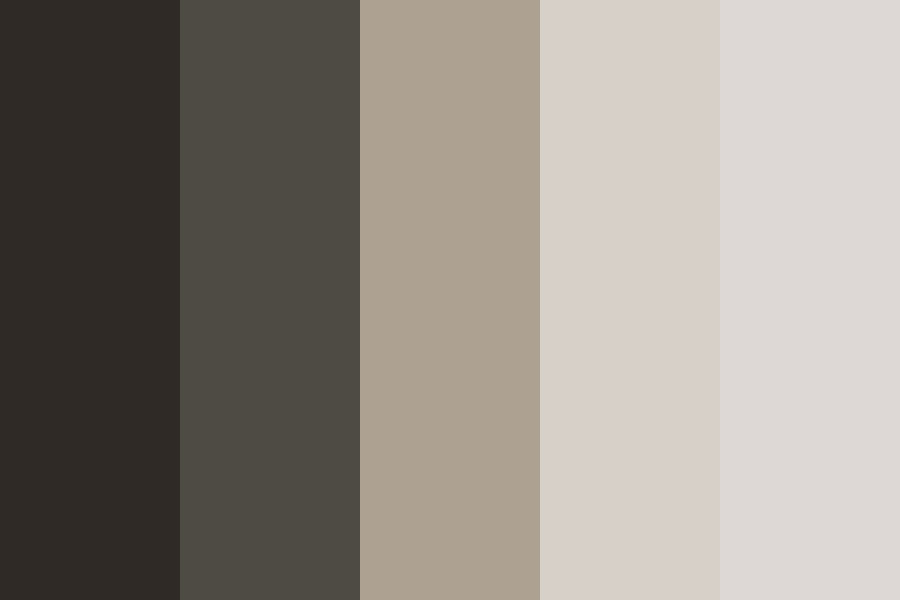
People keep returning to a neutral color palette because it is easy to live with and easy to style. These shades rarely clash, and they work with many materials, from wood and linen to metal and glass. That makes them a smart choice for both personal spaces and professional projects.
There is also a psychological reason they work so well. Research in environmental psychology has long shown that soft, low-saturation colors tend to feel less stimulating than bright ones. In plain terms, a neutral color palette often helps a space feel restful and organized.
Some common reasons people choose a neutral color palette include:
- It creates a calm and clean look
- It makes spaces feel larger and lighter
- It pairs well with almost any accent color
- It offers long-term style value
- It helps products, rooms, or outfits feel polished
From my own experience, clients often ask for “something timeless” when they are unsure about color. A neutral color palette usually solves that problem without feeling safe or flat.

Common Shades in a Neutral Color Palette
A neutral color palette is broader than many people think. It is not just white and gray. There are warm neutrals, cool neutrals, and deep neutrals, and each group creates a different mood.
Warm Neutrals
Warm neutrals have yellow, red, or brown undertones. They feel inviting and soft.
Examples include:
- Cream
- Beige
- Tan
- Camel
- Warm taupe
- Soft brown
These tones are a great fit for cozy homes, relaxed branding, and natural materials like oak and rattan.
Cool Neutrals
Cool neutrals lean toward blue, green, or violet undertones. They feel crisp and fresh.
Examples include:
- Cool gray
- Stone
- Silver
- Soft white
- Charcoal with blue undertones
These shades work well in modern homes, clean UI design, and professional settings.
Deep Neutrals
Deep neutrals add contrast and structure. They ground a design.
Examples include:
- Espresso
- Mocha
- Slate
- Black
- Deep charcoal
These colors are useful when a space or design needs definition without strong color.
Choosing the right neutral color palette often comes down to undertone matching. If the undertones fight each other, the palette can feel off even if every color is technically “neutral.”
How to Build a Neutral Color Palette
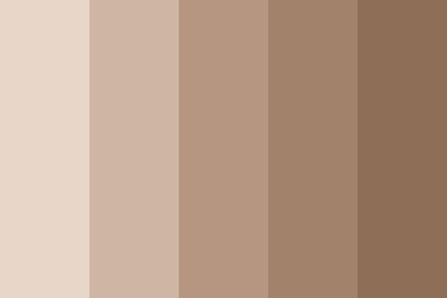
Building a neutral color palette is less about guessing and more about balance. You want enough contrast to keep things interesting, but not so much that the palette feels harsh.
Here is a simple process I use:
-
Choose a base neutral
Start with the main color that will appear most often. This may be warm white, soft gray, beige, or greige. -
Add a support neutral
Pick a second shade that is slightly darker or lighter. This creates depth and keeps the palette from looking one-note. -
Include a grounding tone
Add one deeper neutral such as charcoal, espresso, or taupe to anchor the design. -
Test under real light
Light changes everything. A neutral color palette can look creamy in daylight and yellow under warm lamps. -
Add one accent if needed
Even a neutral color palette benefits from a small accent. Black, brass, green, navy, or terracotta can bring life without breaking the calm.
One mistake I made early in my work was choosing neutrals that were too close in value. The result looked flat and dull. Once I started using more contrast, the palette felt richer and more intentional.
Neutral Color Palette in Interior Design
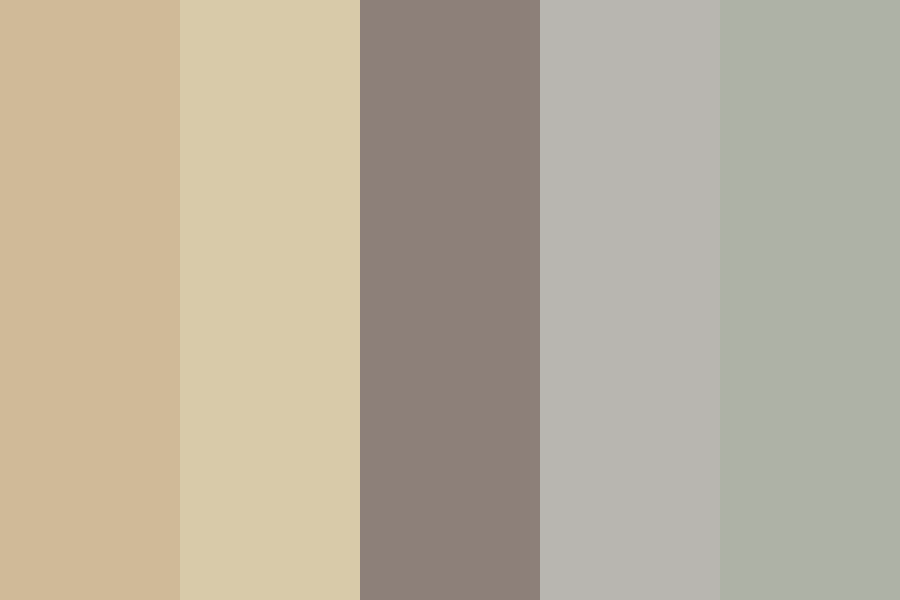
A neutral color palette is one of the most trusted choices in interior design because it makes rooms feel peaceful and adaptable. It works in bedrooms, living rooms, kitchens, offices, and even small apartments where light matters a lot.
In homes, a neutral color palette can:
- Make a room feel bigger
- Reflect natural light better
- Create a calm mood
- Support changing decor over time
- Make furniture and textures stand out
If you want the room to feel warm, choose cream, beige, wood, and soft brown. If you want it to feel crisp, go with white, gray, stone, and black accents. If you want a more layered look, mix several neutrals with different textures such as wool, linen, leather, and matte finishes.
I have seen the biggest design win happen when people stop chasing perfect color and start thinking about texture. In a neutral color palette, texture is the personality.
Neutral Color Palette in Fashion and Personal Style
A neutral color palette is also a favorite in fashion because it makes outfits easy to mix and match. A wardrobe built around neutrals can save time, reduce decision fatigue, and create a polished look without much effort.
Popular neutral clothing colors include:
- White
- Ivory
- Black
- Gray
- Navy
- Beige
- Camel
- Olive
- Brown
A neutral color palette in fashion works well because it allows small details to shine, such as tailoring, fabric quality, or accessories. A simple beige coat with black boots can look more elegant than a loud outfit that tries too hard.
Many stylists also recommend using a base of neutrals and adding one or two accent colors. That keeps the wardrobe flexible while still feeling personal.
Neutral Color Palette in Branding and Web Design
In branding, a neutral color palette can communicate trust, luxury, simplicity, and sophistication. It is common in beauty, architecture, wellness, finance, and premium lifestyle brands. The reason is simple: neutral colors often feel stable and mature.
For web design, a neutral color palette improves readability and helps users focus on content. White space, soft gray backgrounds, and dark text can reduce strain and improve the overall experience. Accessibility matters here too. Good contrast between text and background is essential for usability.
A strong neutral color palette in branding usually includes:
- A light base color
- A darker text color
- One accent color for buttons or links
- A few supporting shades for backgrounds and borders
In practice, I have found that too many neutral shades can still confuse users if they are not organized well. The palette should look subtle, but it still needs hierarchy.
Benefits of Using a Neutral Color Palette
A neutral color palette offers both visual and practical benefits. That is why it stays popular across so many design fields.
Some of the biggest benefits are:
-
Timeless appeal
Neutral shades do not go out of style quickly. -
Flexibility
They pair well with bold colors, natural materials, and different textures. -
Calm atmosphere
Soft tones can reduce visual clutter and create a peaceful feel. -
Easy coordination
It is simpler to match furniture, clothes, branding elements, or decor. -
Professional look
A neutral color palette often appears refined and trustworthy. -
Better focus on form and texture
Without strong color distractions, structure becomes more noticeable.
These benefits explain why neutral palettes are often used in premium brands and modern homes. They are the visual equivalent of a steady voice in a crowded room.
Limitations of a Neutral Color Palette
Even though a neutral color palette is versatile, it is not perfect for every situation. When overused or poorly planned, it can feel lifeless or too safe.
Common limitations include:
- It can look flat if there is not enough contrast
- It may feel cold if the wrong undertones are used
- It can seem unfinished without texture or accent
- Some people find it too plain for expressive spaces
This is where many beginners go wrong. They assume neutral means “easy,” but a good neutral color palette still needs planning. You have to think about depth, balance, lighting, and tone.
The good news is that these issues are easy to fix. Add texture, use layered shades, and include one strong anchor color. Even a small amount of contrast can give the whole palette more life.
How to Make a Neutral Color Palette Feel Interesting
A neutral color palette should feel calm, not empty. The best designs usually use a mix of shade, texture, and contrast to create depth.
Try these ideas:
- Mix matte and glossy finishes
- Use natural materials like wood, stone, linen, and wool
- Add black or dark brown for structure
- Layer light, medium, and dark neutrals
- Include subtle patterns such as stripes, grain, or weave
- Bring in one quiet accent, like olive green or muted terracotta
I often tell people to think of a neutral color palette like a good soup. The ingredients may seem simple on their own, but the mix is what makes it memorable.
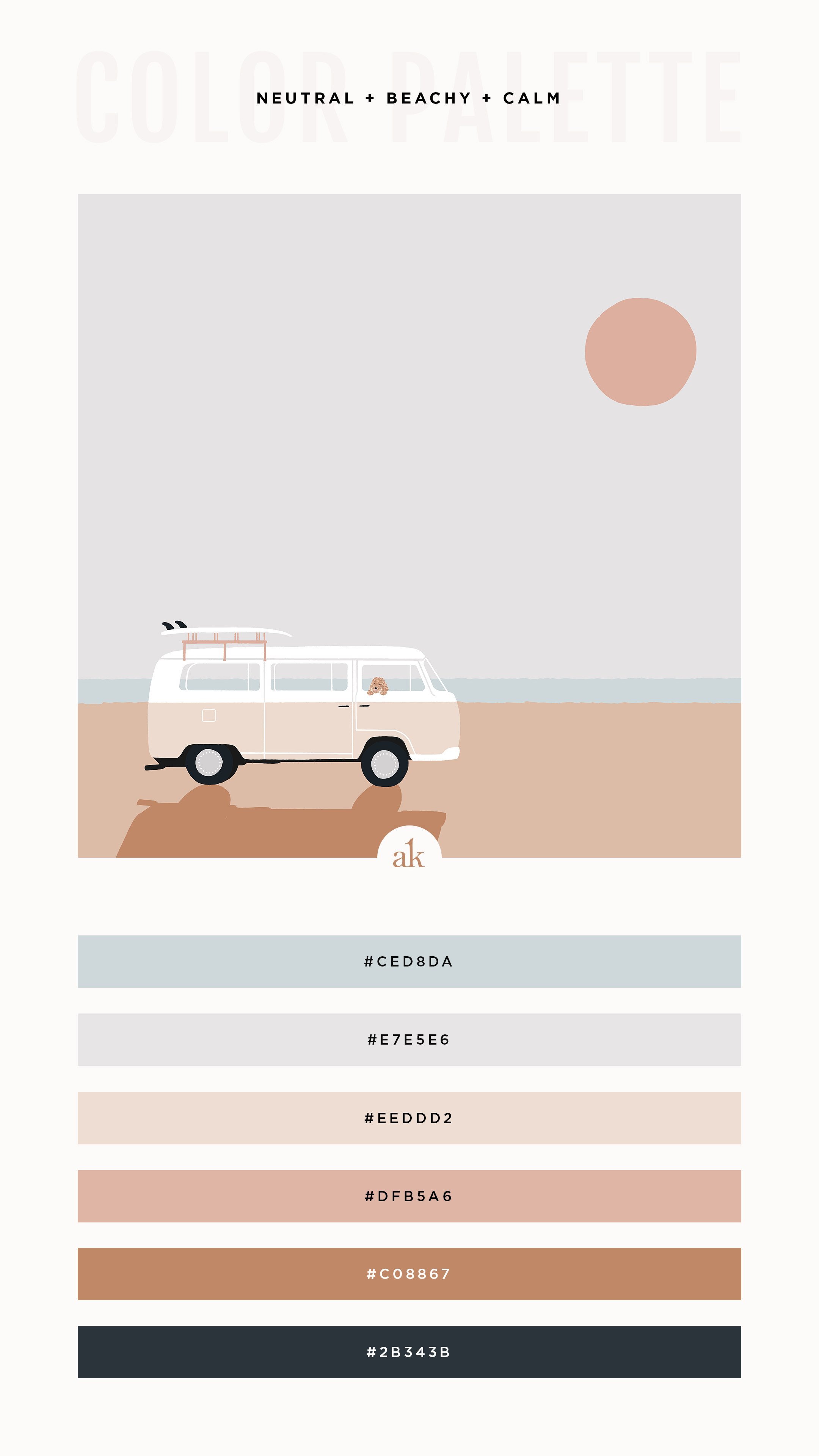
Neutral Color Palette Examples
A few real-world examples can make the idea easier to use.
Cozy Home Palette
- Warm white
- Beige
- Light brown
- Taupe
- Charcoal
This combination feels relaxed and lived-in. It works well in bedrooms and family spaces.
Modern Office Palette
- Soft white
- Cool gray
- Slate
- Black
- Pale wood
This palette feels clean and focused. It is great for workspaces and digital brands.
Elegant Brand Palette
- Ivory
- Greige
- Camel
- Espresso
- Brass accent
This version feels premium and grounded. It is often used in fashion, beauty, and luxury services.
Minimal Wardrobe Palette
- White
- Black
- Gray
- Navy
- Camel
This mix makes outfit building easier and more versatile. It also reduces the chance of clashing pieces.
Tips for Choosing the Right Neutral Color Palette
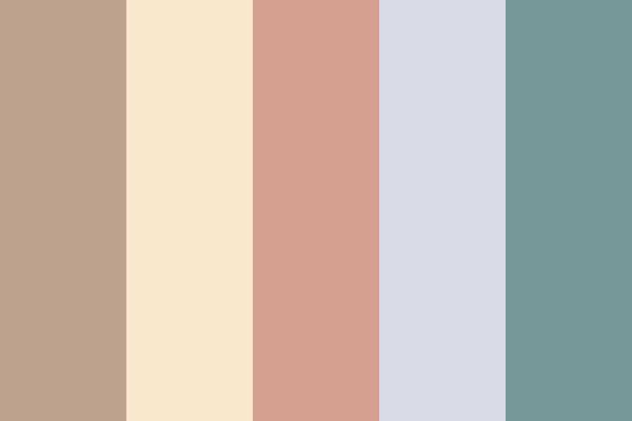
A neutral color palette should fit the space, the purpose, and the light. That means there is no single perfect version.
Here are some practical tips:
- Test paint samples or swatches in morning and evening light
- Compare warm and cool undertones before buying
- Use darker neutrals to ground large open areas
- Choose lighter neutrals for small or dark spaces
- Keep one tone dominant so the palette feels clear
- Use texture if the palette starts to feel too plain
If you are unsure, start with a base of soft white or greige. Those shades are usually the easiest to build on. From there, add depth with wood, stone, black, or another earthy tone.
Frequently Asked Questions About Neutral Color Palette
What colors are considered a neutral color palette?
A neutral color palette usually includes white, cream, beige, taupe, gray, brown, and black. It can also include muted tones like greige, stone, and soft olive when they stay low in saturation.
Is a neutral color palette boring?
Not at all. A neutral color palette can feel rich and layered when you use texture, contrast, and different undertones. The key is to avoid making every shade the same value.
What is the best neutral color palette for a small room?
Light neutrals like soft white, cream, pale gray, or light beige usually work best in small rooms. They reflect more light and help the space feel open. Adding one darker accent can keep the room from looking washed out.
Can a neutral color palette include color?
Yes, as long as the added color stays soft and balanced. Muted green, dusty blue, terracotta, and navy are often used as accents in a neutral color palette.
How do I choose between warm and cool neutrals?
Look at the light in your space and the materials around it. Warm neutrals pair well with wood and natural textures, while cool neutrals often suit modern finishes and bright light.
Conclusion
A neutral color palette is one of the most useful tools in design because it brings calm, balance, and flexibility. It can make a room feel more open, a wardrobe easier to manage, and a brand more polished. When you choose the right shades and add enough texture and contrast, a neutral color palette becomes far from plain.
If you are planning a space, outfit, or brand identity, start simple and build with intention. Test your neutrals, trust the light, and do not be afraid to layer tones for depth. If this guide helped, explore more design tips and share your own favorite neutral color palette in the comments.