
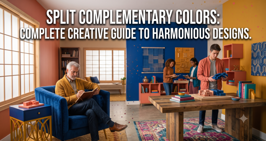
Split Complementary Colors: Easy Guide For Vibrant Designs
Learn split complementary colors to create bold, balanced palettes that make your designs stand out fast.
Learn split complementary colors to create bold, balanced palettes that make your designs stand out fast.
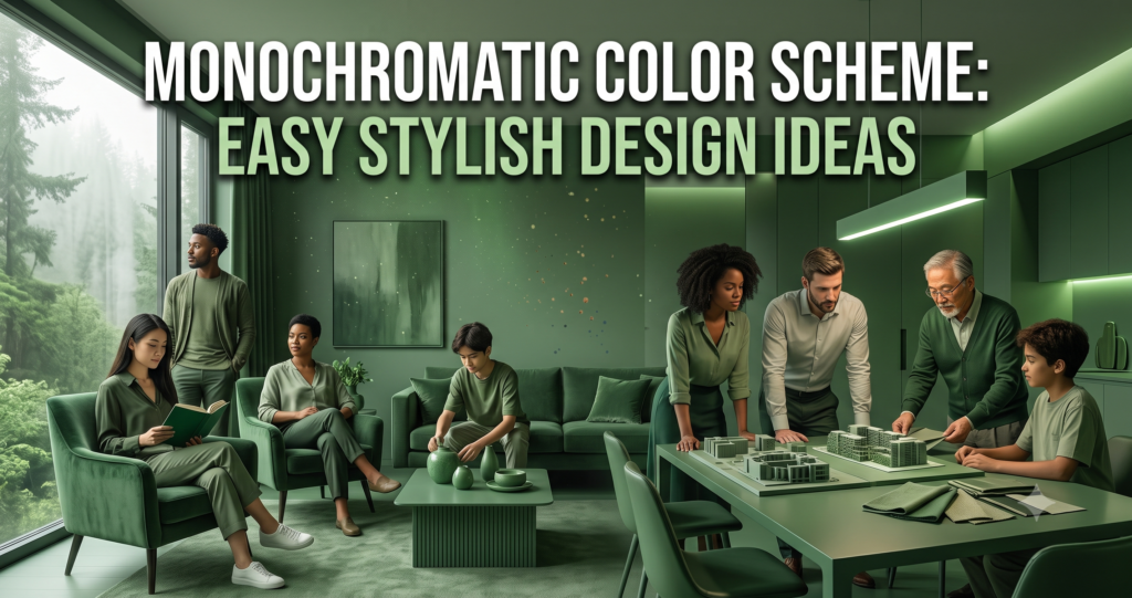
Learn how a monochromatic color scheme creates clean, cohesive designs with depth, balance, and style. Get practical tips and examples.

Learn how color temperature affects mood, productivity, and design, plus tips to choose the best lighting for every space.

Learn how color saturation affects mood, contrast, and design impact, with simple tips to make your visuals stand out.

Improve line quality in drawing with simple tips for cleaner, more confident strokes that make your artwork stand out.

Master visual weight in composition to create balanced, eye-catching designs with simple tips, examples, and expert techniques.
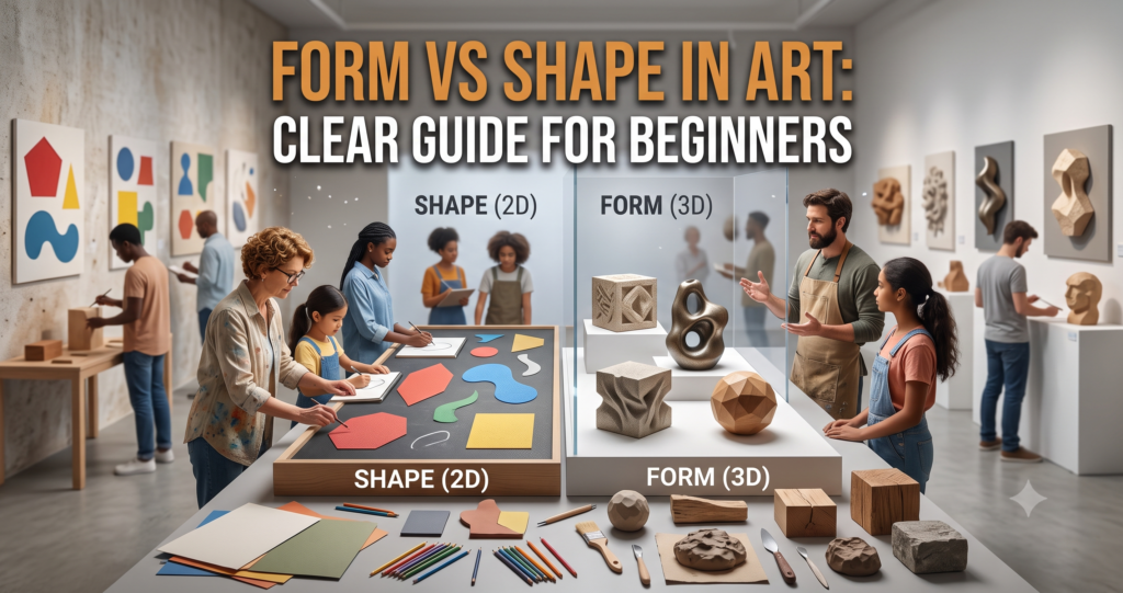
Learn form vs shape in art with simple examples, key differences, and tips to improve your artwork fast.
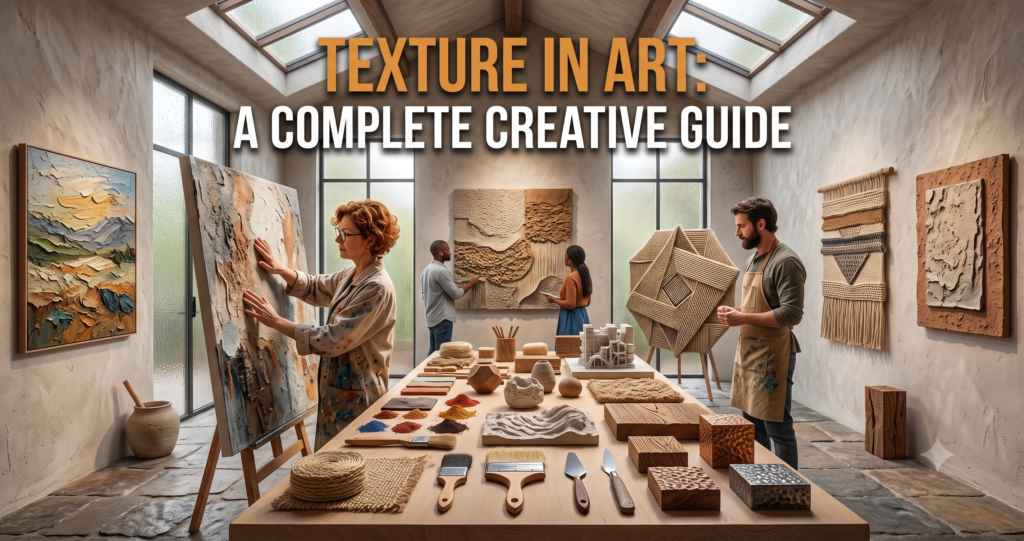
Learn how texture in art adds depth, emotion, and interest. Explore techniques, examples, and ideas to improve your artwork today.

Learn how scale in art shapes composition, emotion, and visual impact with practical tips for stronger artwork.
Explore pattern in art with clear examples, styles, and meanings that make visuals powerful. Learn why patterns captivate.